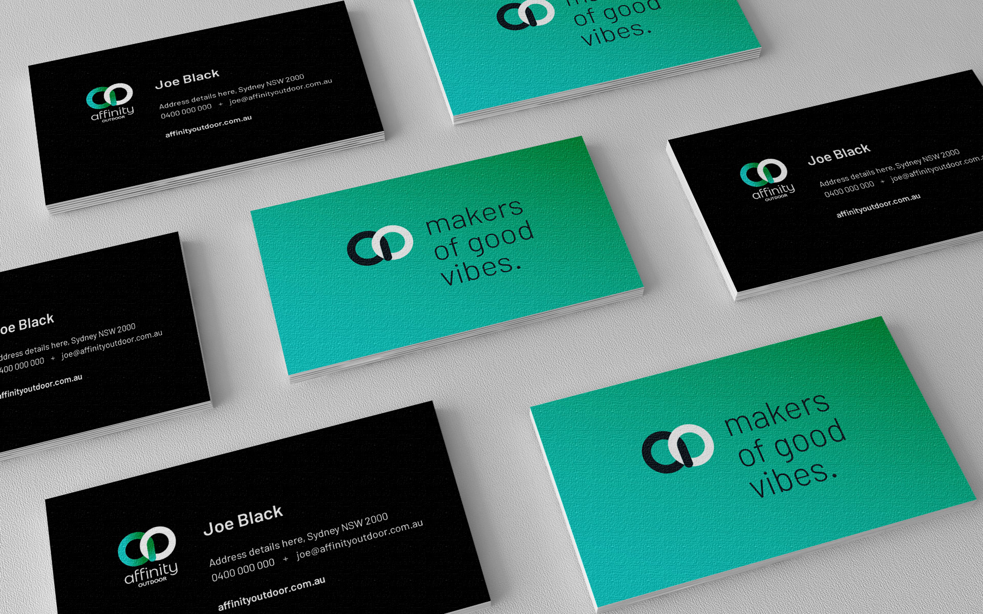
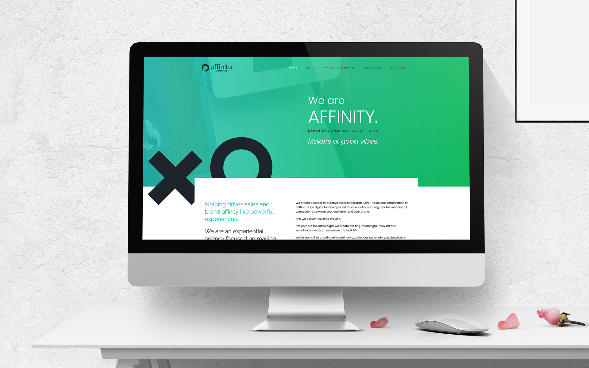
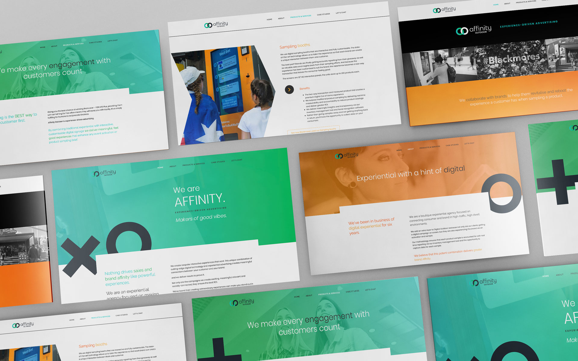
Affinity Outdoor are a leading DOOH advertising company with a focus on sampling. Formerly iSeek Networks, the company needed a new face for its new name.
With the animation of DOOH advertising in mind, a neon sign like style of logo was created. The linking of the A and the O is symbolic of the connection between OOH and the new digital aspect.
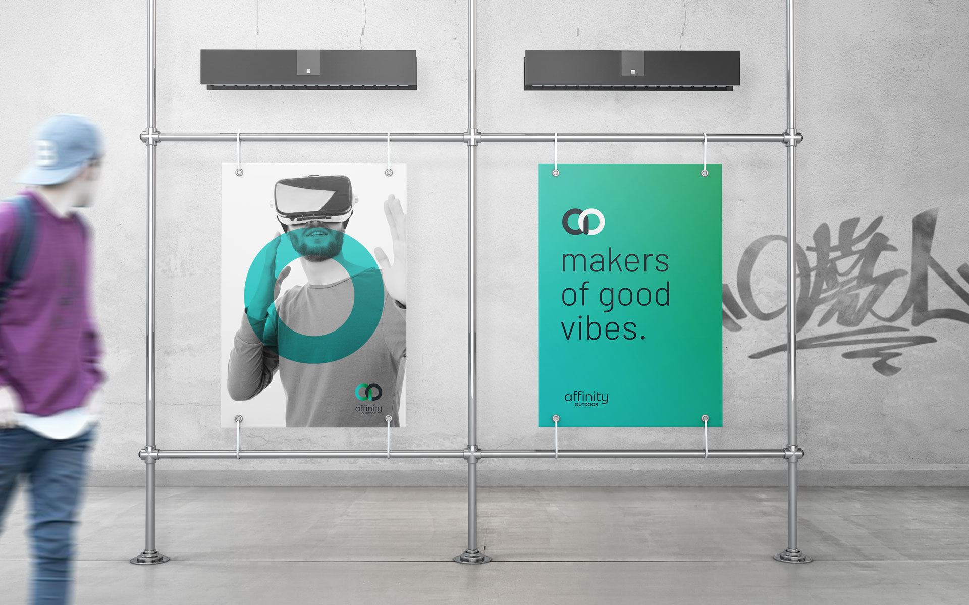
The colour palette was extended to include two gradient tones which have been used across all aspects of the brand and highlight the black and white imagery.
Logo & Branding (on company sub brands) Marketing Materials Advertising Digital Advertising Web Design & Development Internal & External Signage Company & Brand Publications Events
challenge
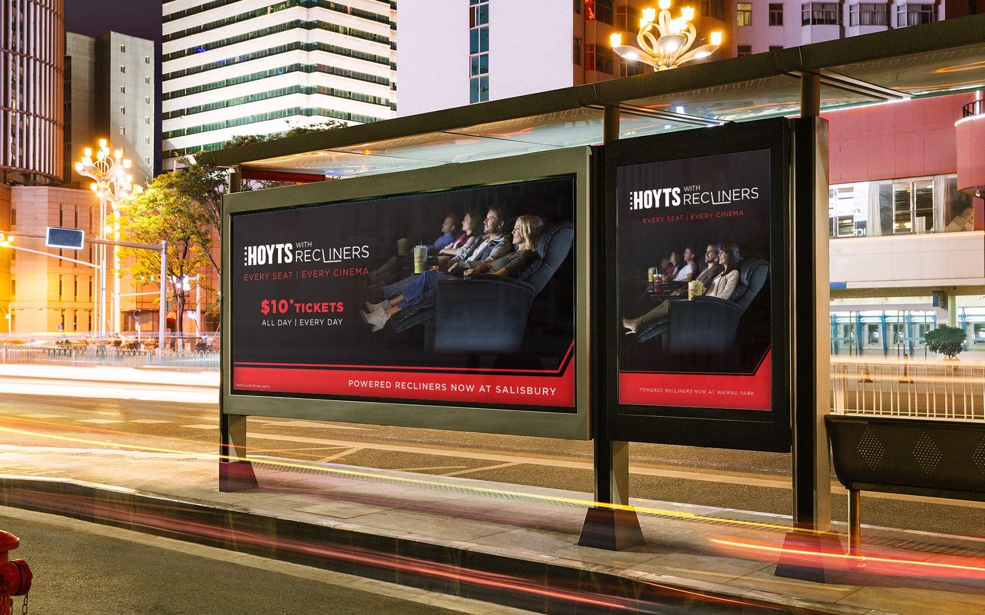
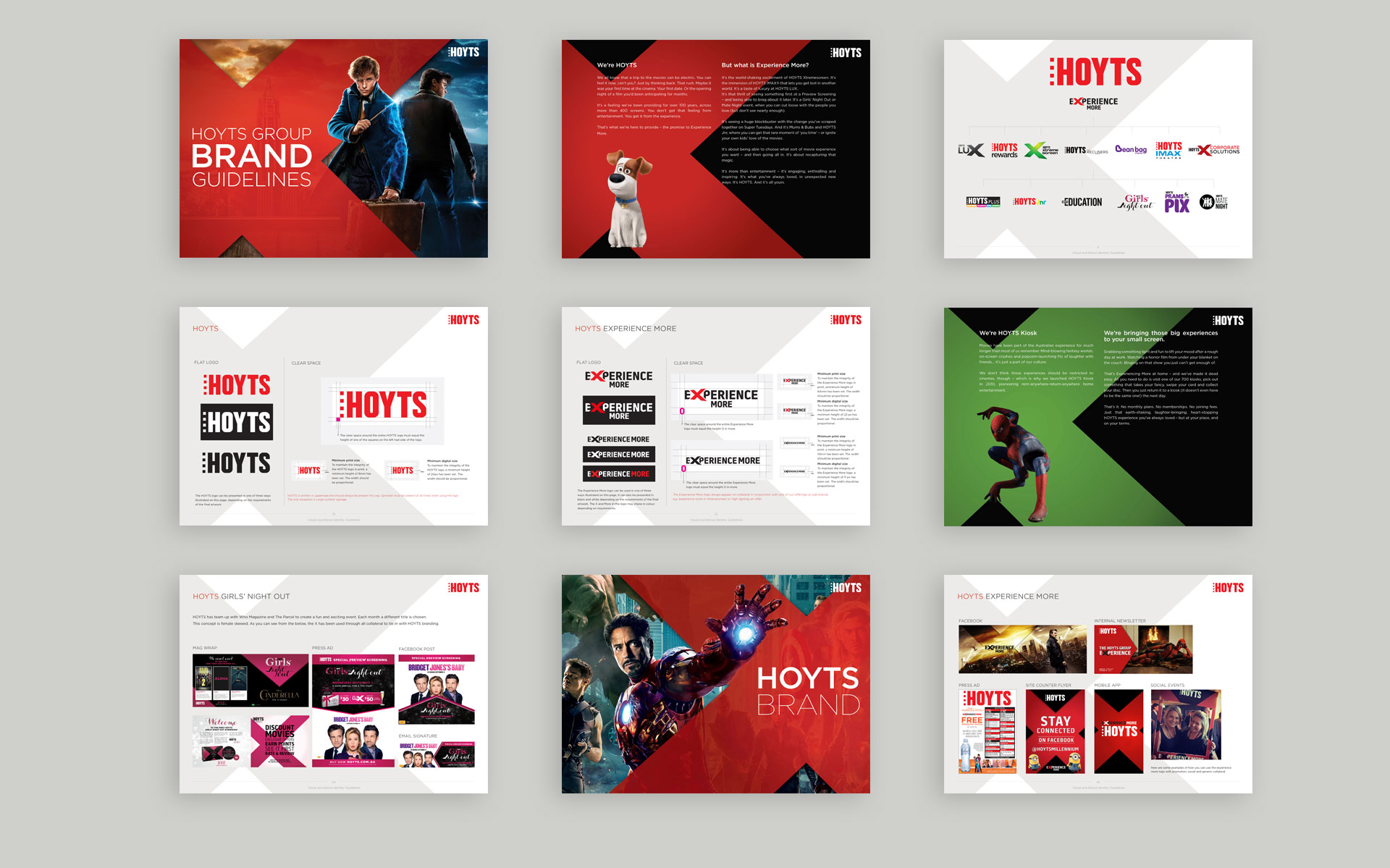
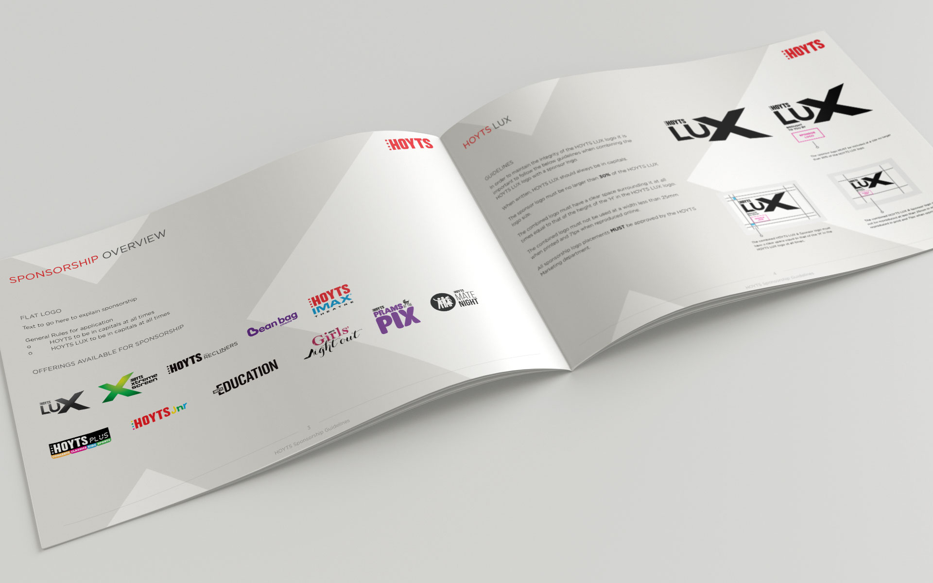
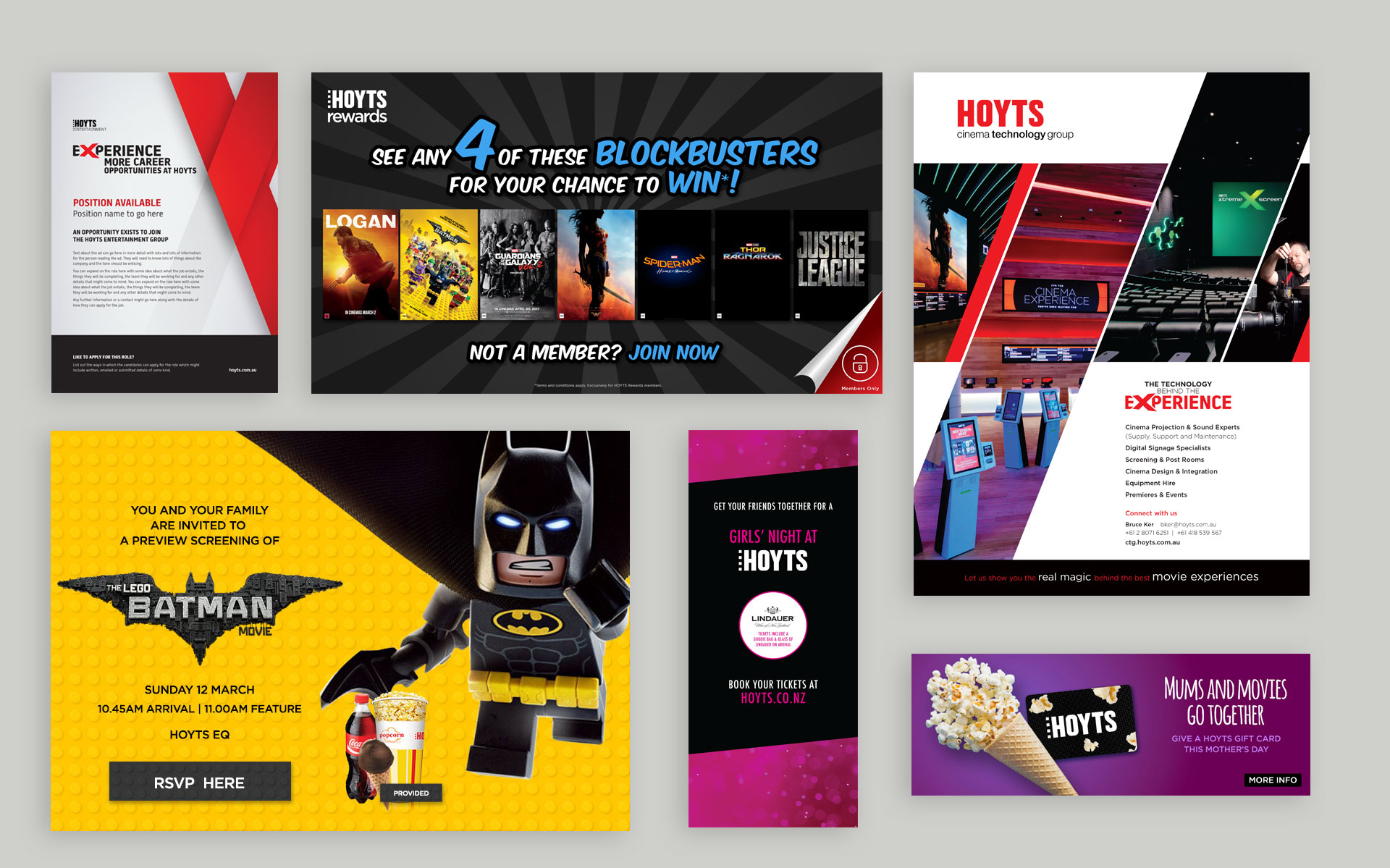
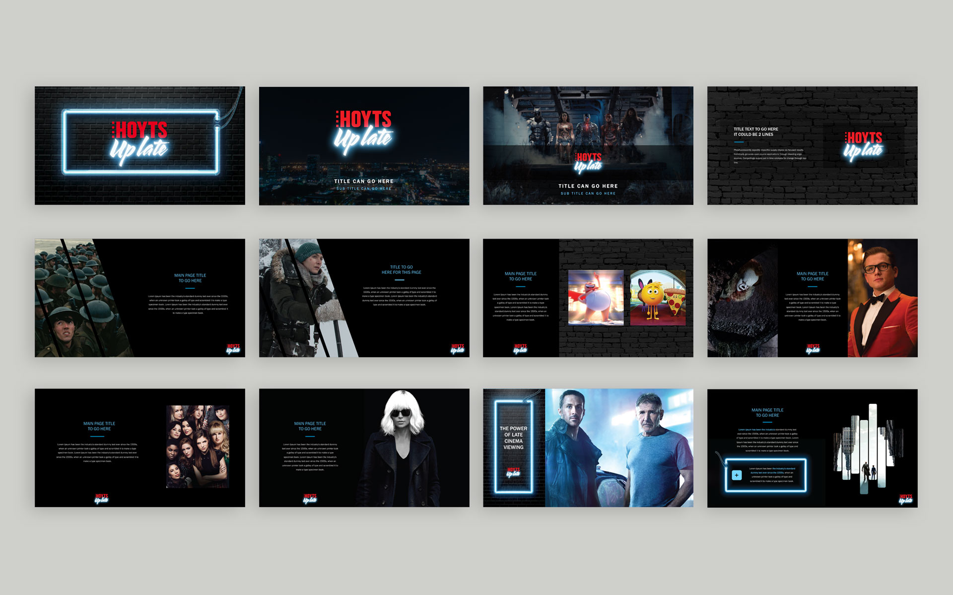
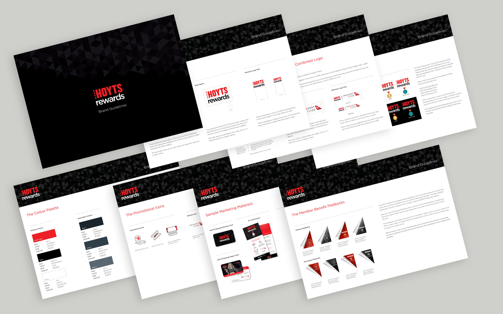
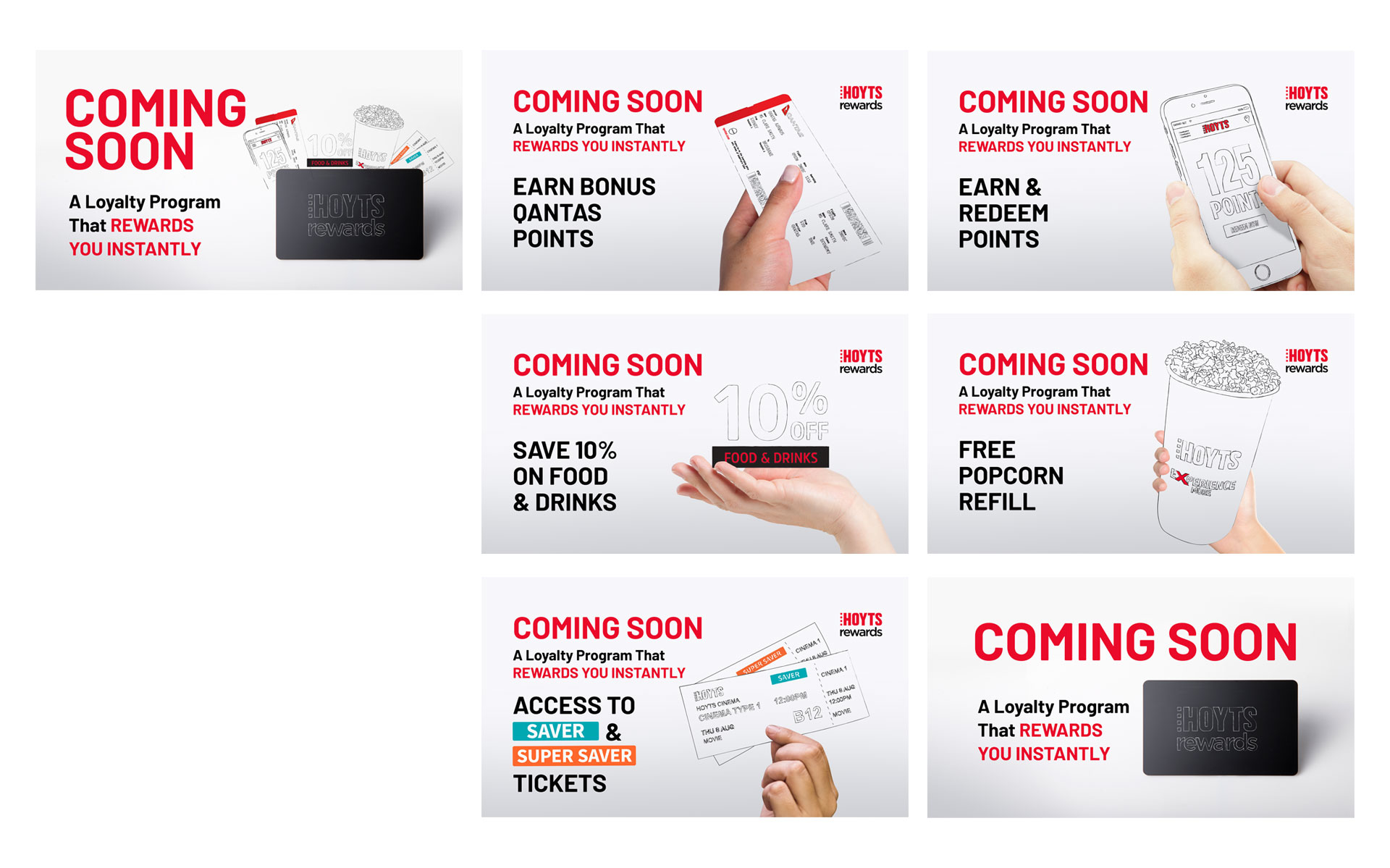
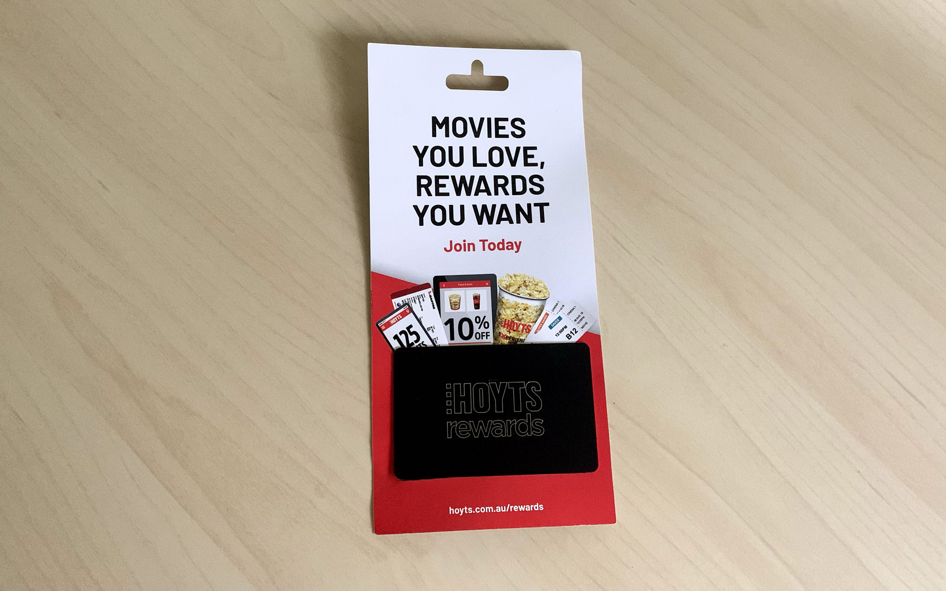
I was contracted to HOYTS helping the Marketing department to firstly create an in-house studio and then to run it until they found a suitable candidate to take the reigns. Following that I stayed on to help them out in the design department working closely with all sub departments including HR, Corporate Solutions, Sales, Marketing and Food & Beverage.
The range of work was wide and varied covering all brands within the business.
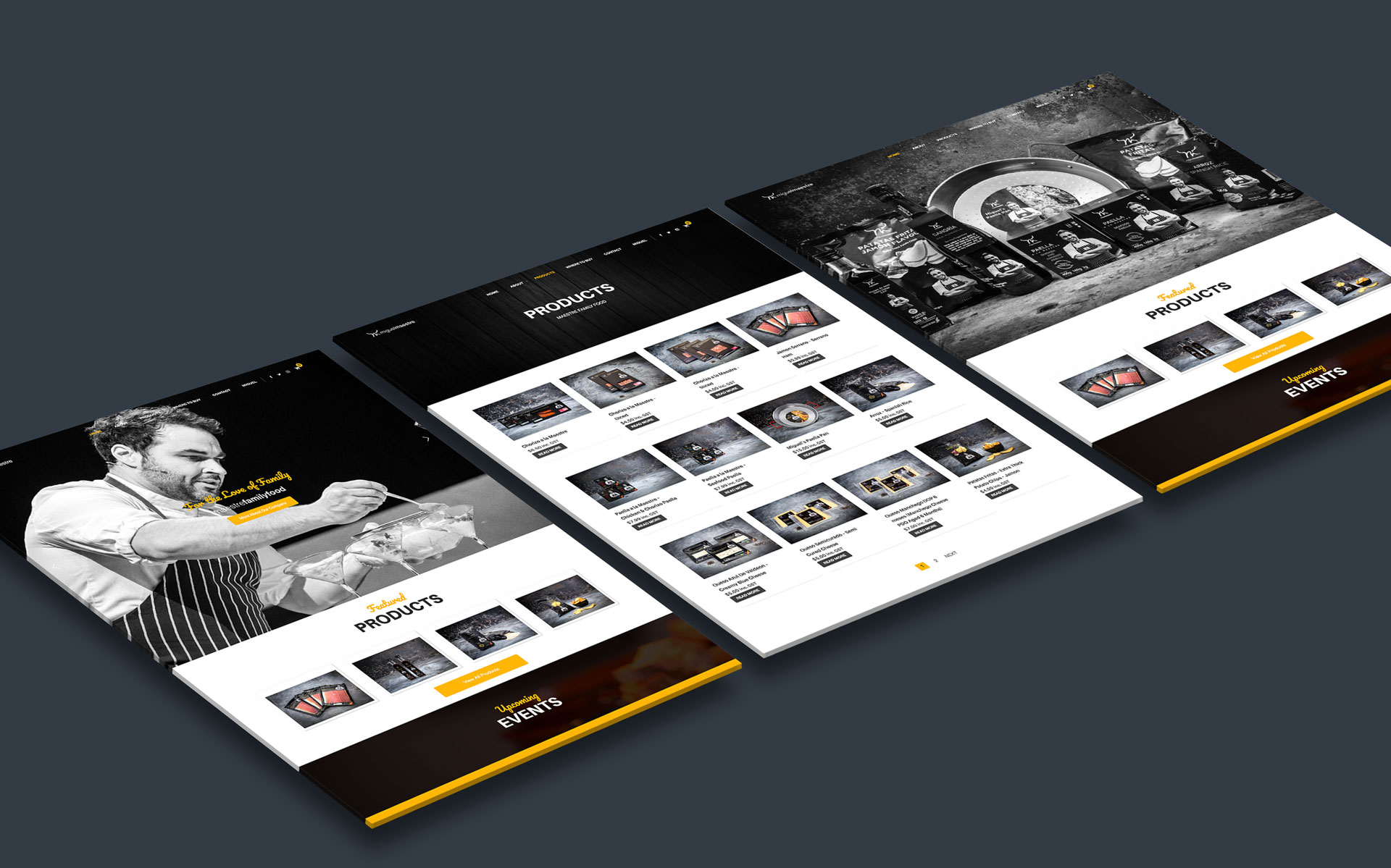
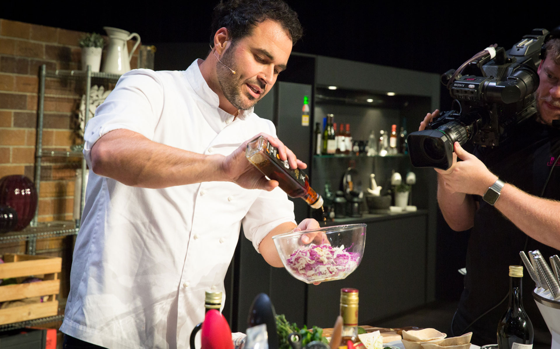
Miguel Maestre is a vibrant Spanish chef who is passionate about his food & his family. Miguel currently appears on The Living Room on Channel 10.
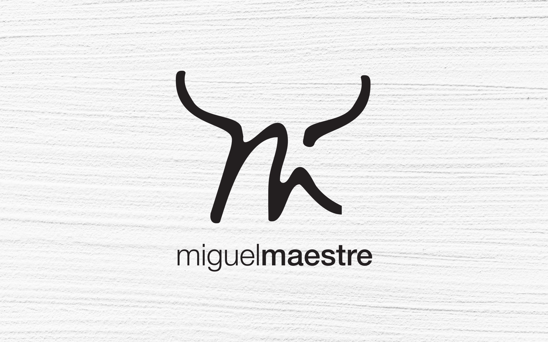
With Miguel’s launch into the world of products he needed to brand himself which is where I came in. Drawing on his Spanish background, I tapped into his heritage and created an icon for him that resembles a bull within the letter ‘M’. This symbol has been aligned with a simple mix of type to create a stunning representation of all things Miguel.
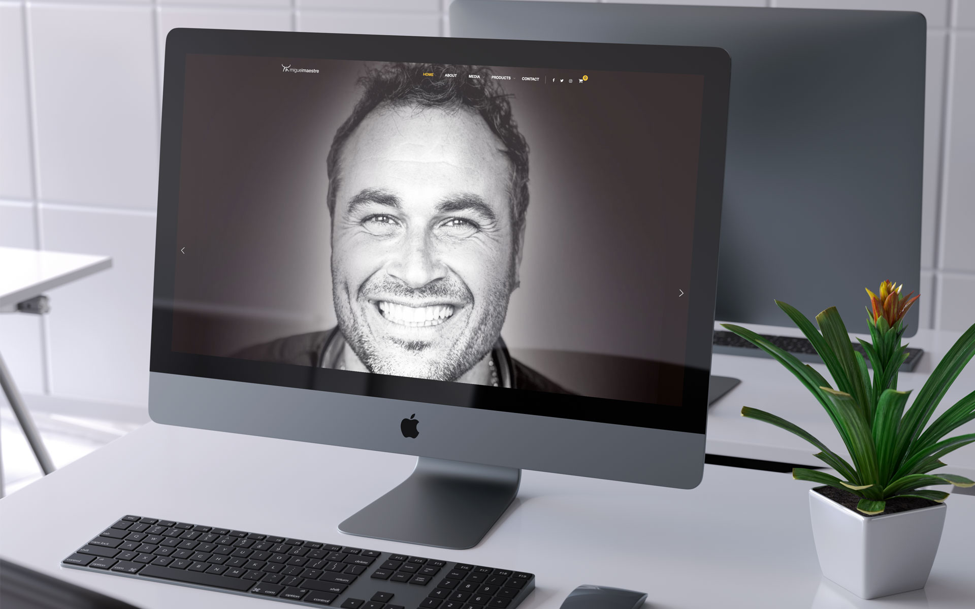
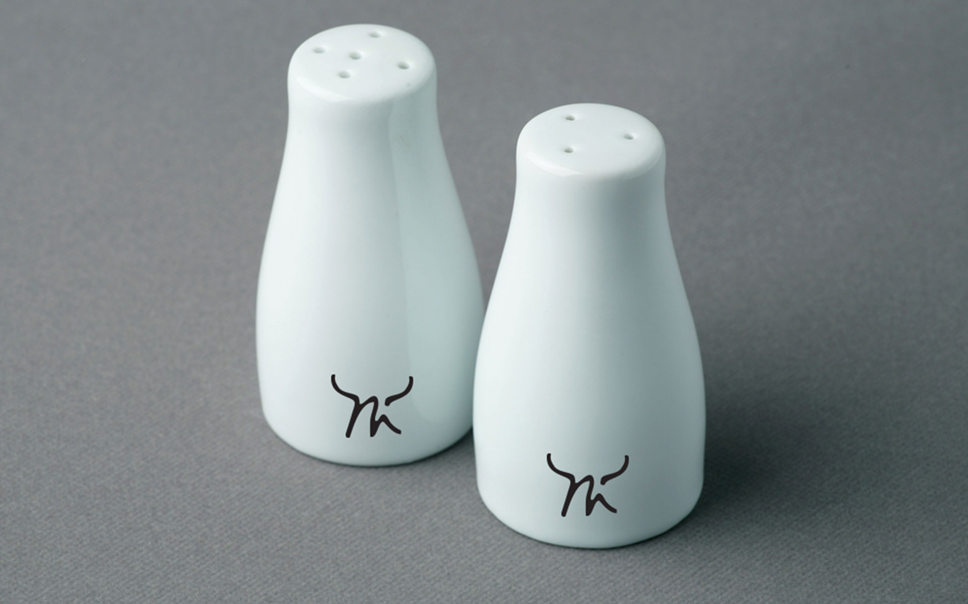
This icon & logotype has been used across packaging, marketing materials and online.
Logo & Branding Marketing Materials Lanyards Powerpoint Presentations Movie Tickets Web Design & Build
challenge
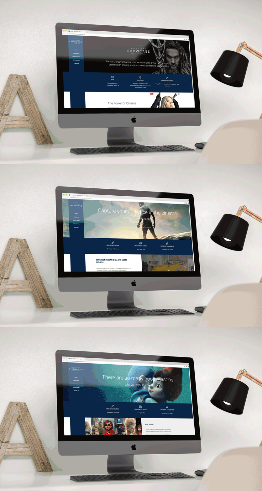
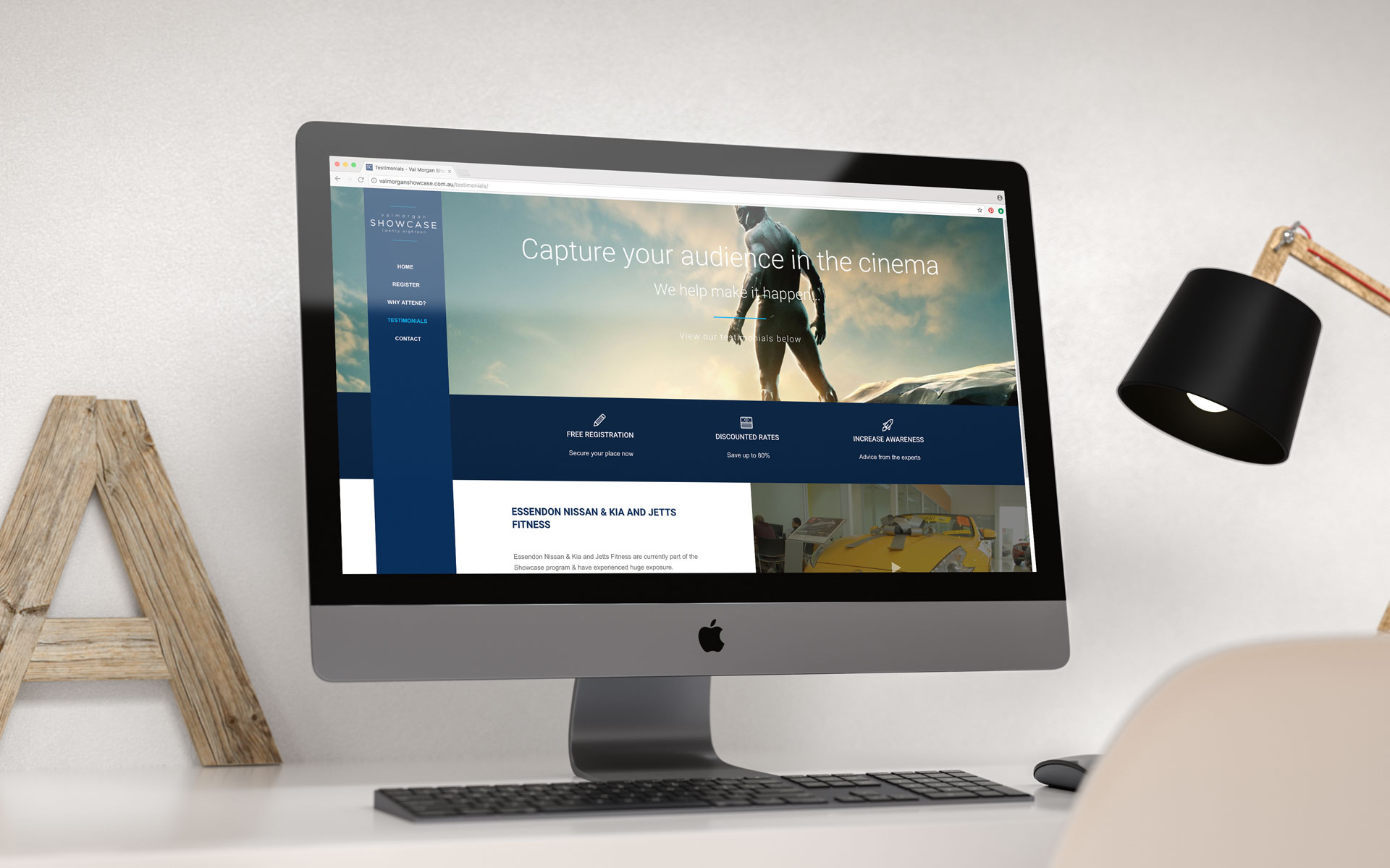
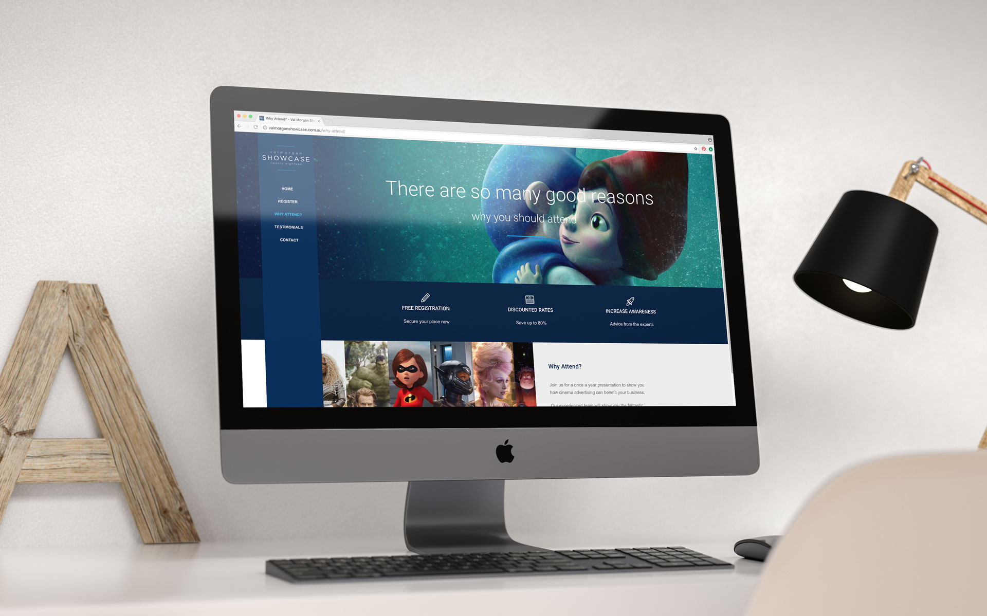
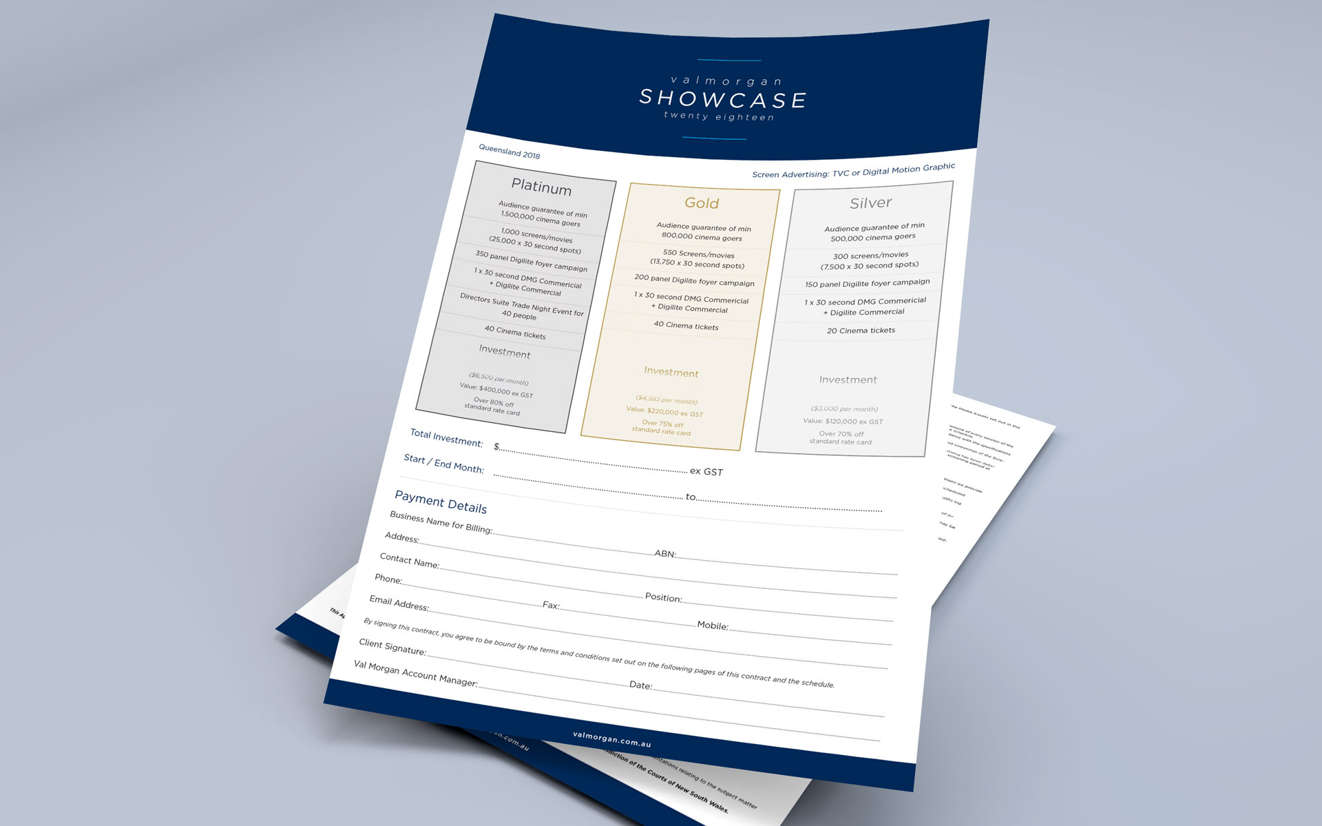
Val Morgan hold their Showcase events on an annual basis Australia wide. These events are aimed at local businesses & promote advertising on the big screen at a reduced rate.
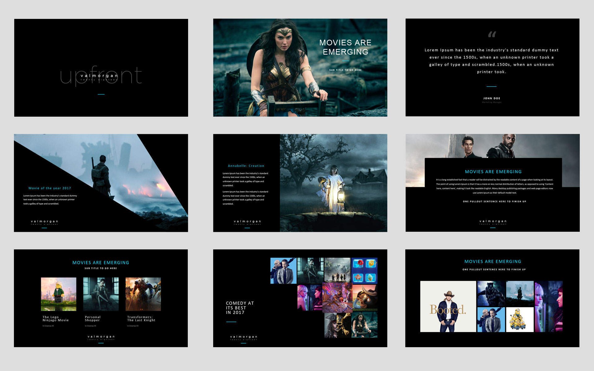
Each year we refresh the brand style & align it closely to the over-arching Val Morgan brand & style. This year all items were updated including the logo, contracts, lanyards, powerpoint presentations, movie tickets & website. The website featured the ability to register online to a maximum number with the ability to check the registrants in on arrival.
Logo & Branding for Val Morgan and its company offerings including Val Morgan Showcase, the ACES, the Upfronts and sub brands Style Guides Stationery Design Email Signatures Advertising Social Marketing Business Flyers Powerpoint Presentations Company & Client Reports Website Design & Build – Val Morgan Showcase and individual event microsite
challenge
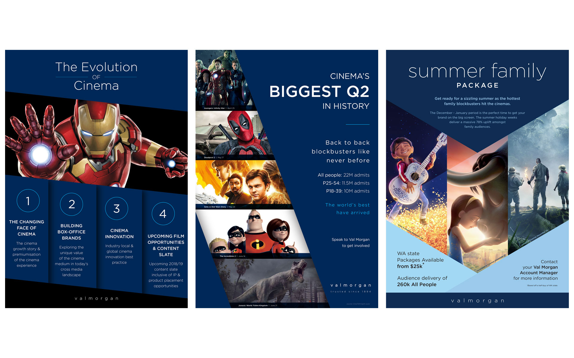
Val Morgan Cinema Network provides cinema advertising across Australia and New Zealand with over 2,000 cinema screens across metro, regional and country areas.
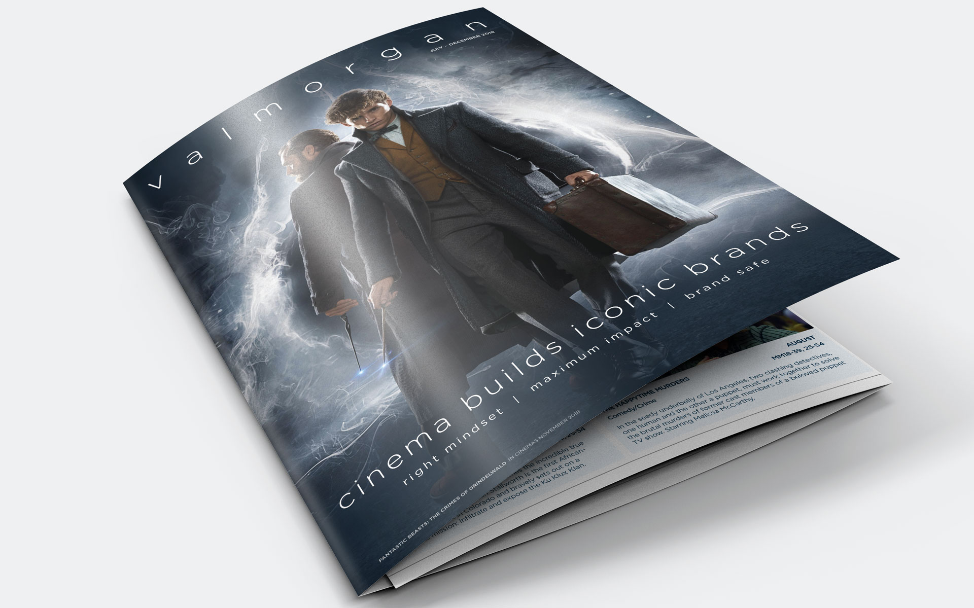
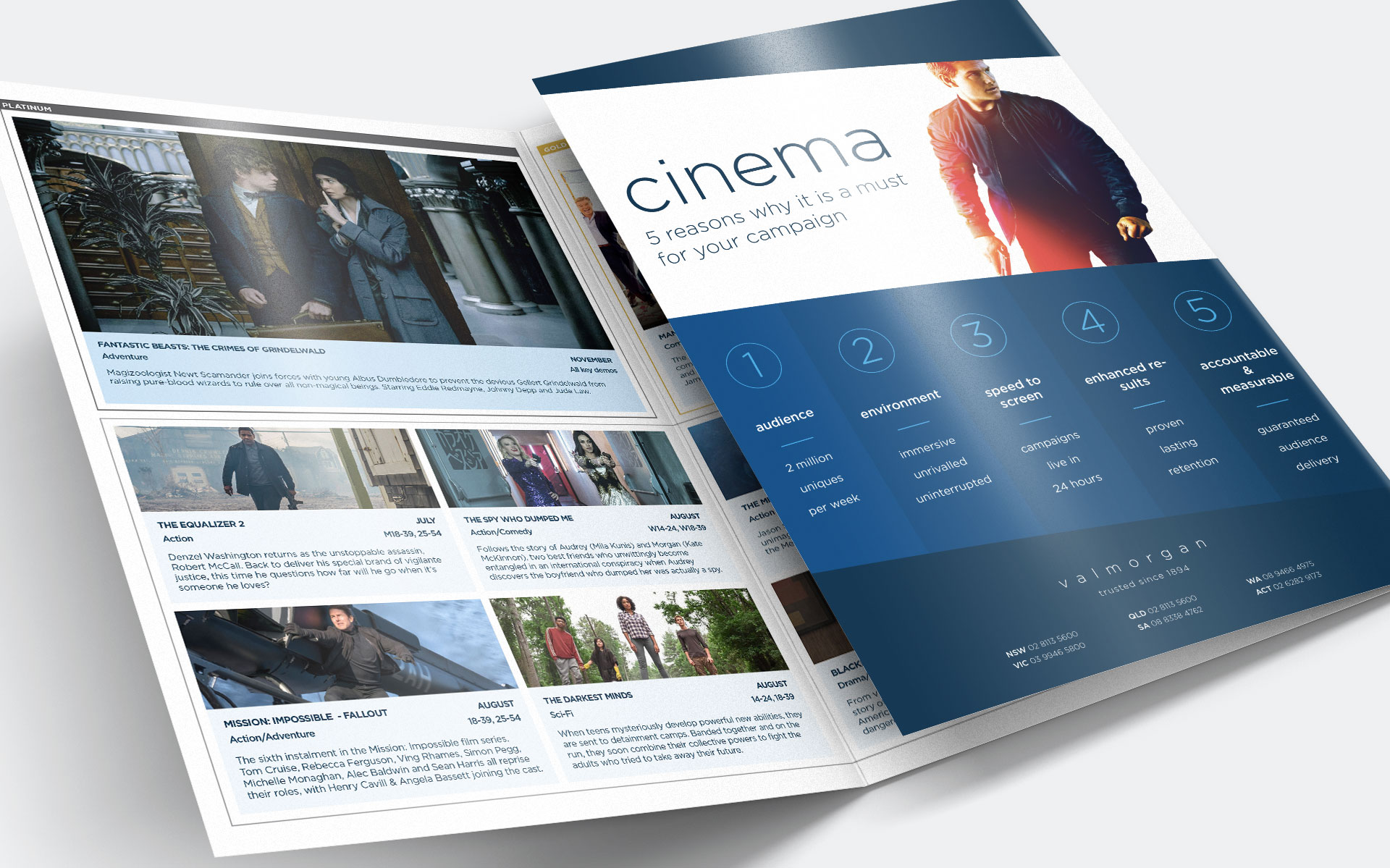
Working in-house at Val Morgan I was initially acquired to streamline their B2B materials which had no consistency across the market. Working closely with the Marketing Manager I created a new direction & brand outline for the company which evolved over the years I was there to include a new logo, new sub branding, marketing materials and online artwork.
I also worked closely with a variety of departments to include event work, regular campaigns to both clients and consumers and presentations for the various sales teams.
Logo & Branding Style Guide Stationery Design Advertising Social Marketing Product Flyers Company Overview Brochure Company White Paper Website Design & Build
challenge
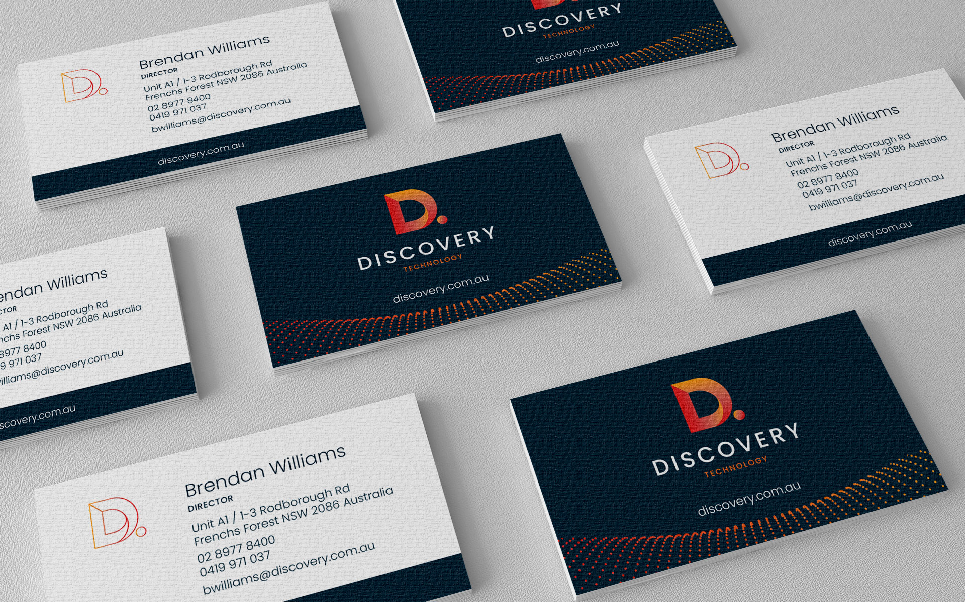
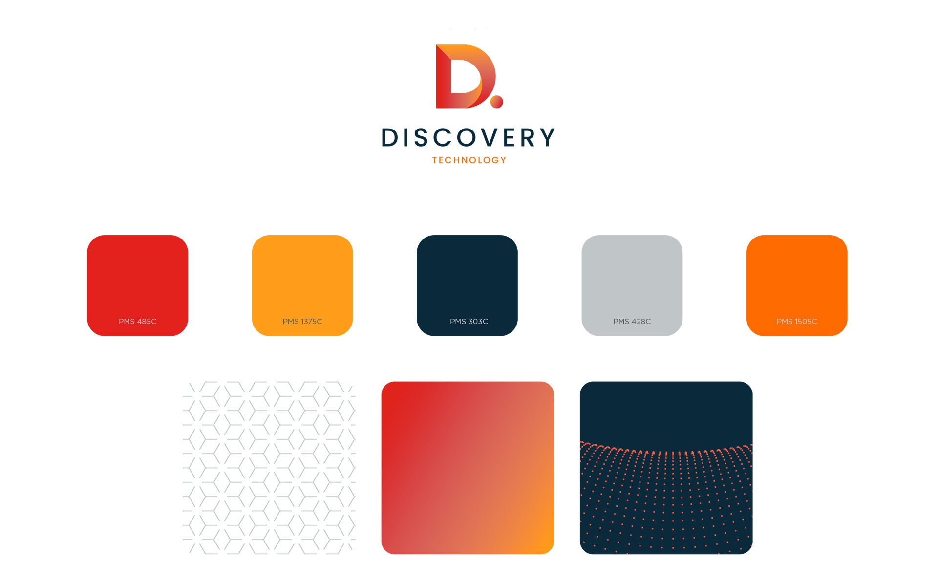
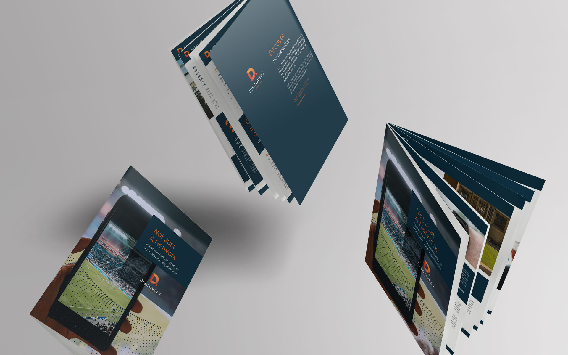
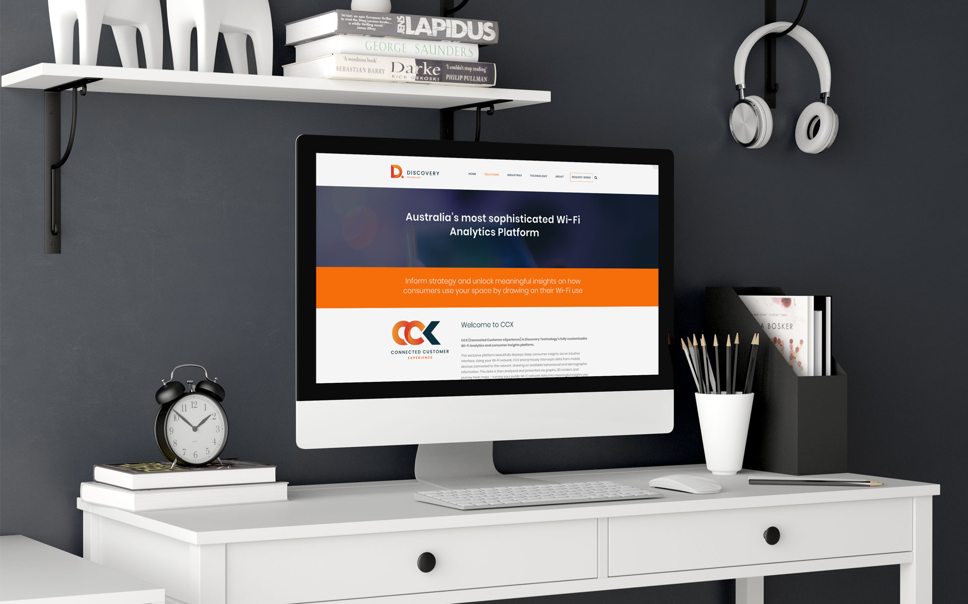
Discovery Technology is a well respected digital Wi-fi provider to large area spaces such as shopping centres, airports and hotels. They were in need of a rebrand to bring their look and feel in line with their updated services.
Keeping in mind the flow of data in the digital world, a gradient was used to flow through the large ‘D.’ icon which represents both the company name and the digital nature of their offering. Additional elements were created to enhance the digital feel.
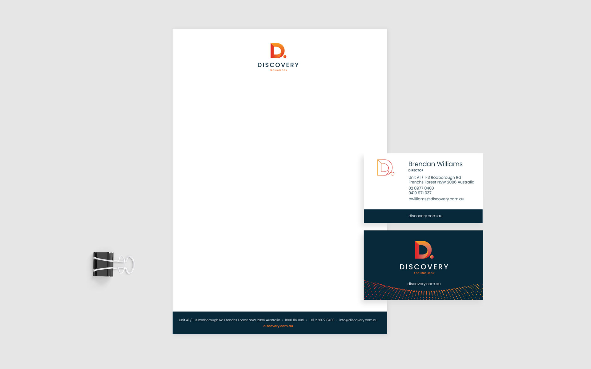
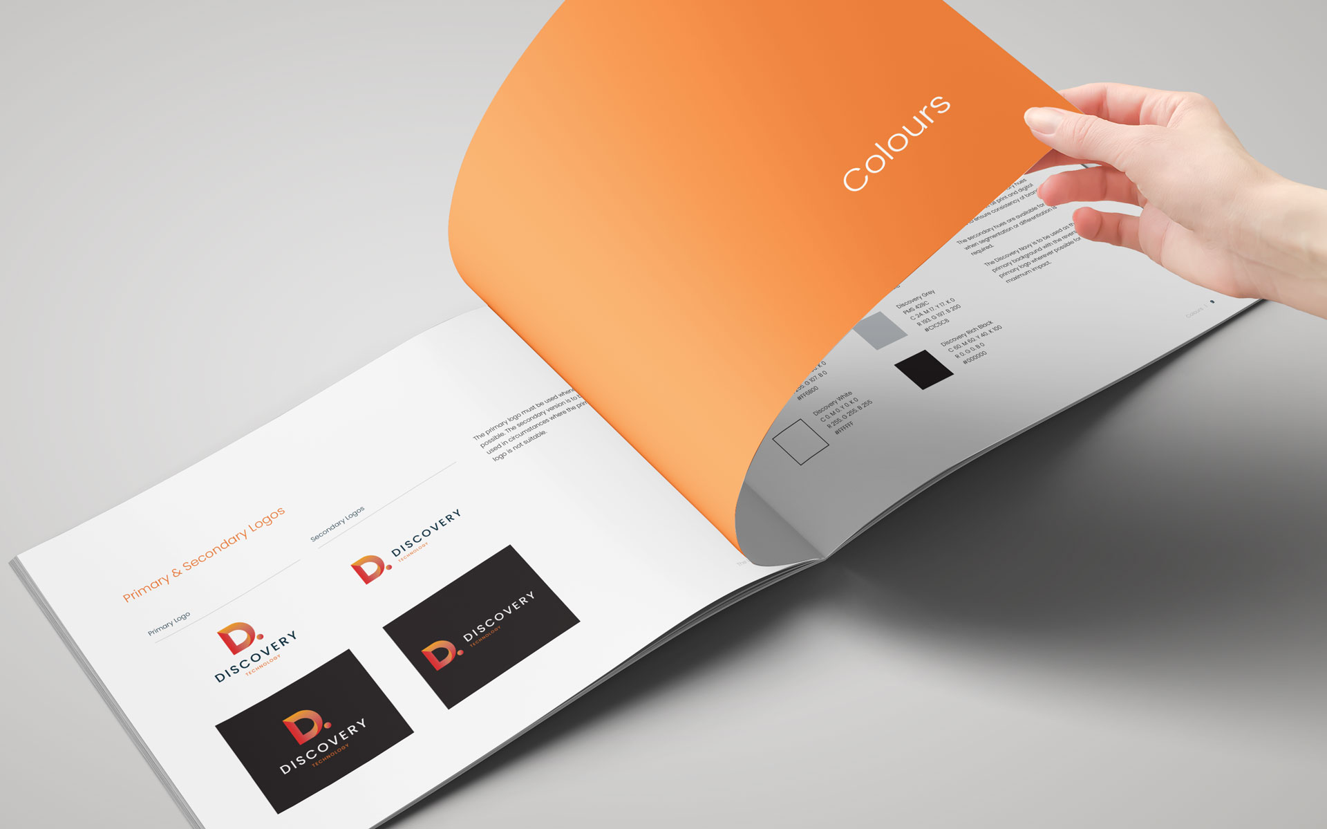
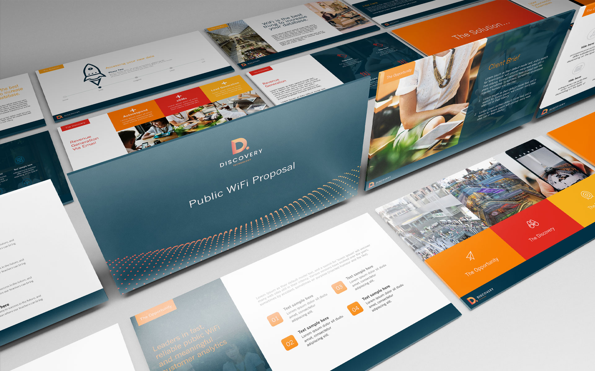
The new brand was pushed through to their sub brands, stationery, marketing and online area with a complete website design & build.
Logo Design & Branding Style Guide Stationery Powerpoint Presentation Template Pull Up Banners
challenge
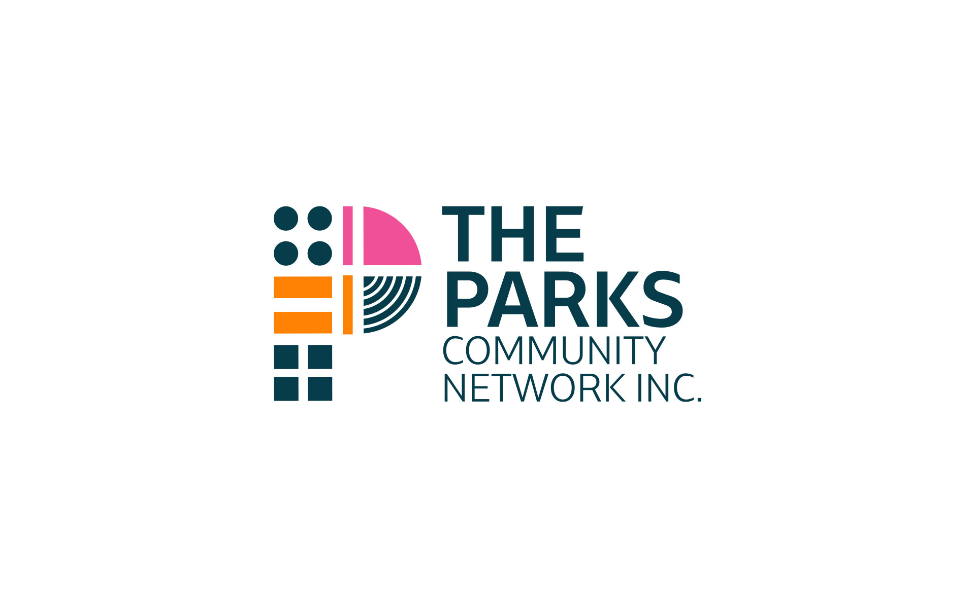
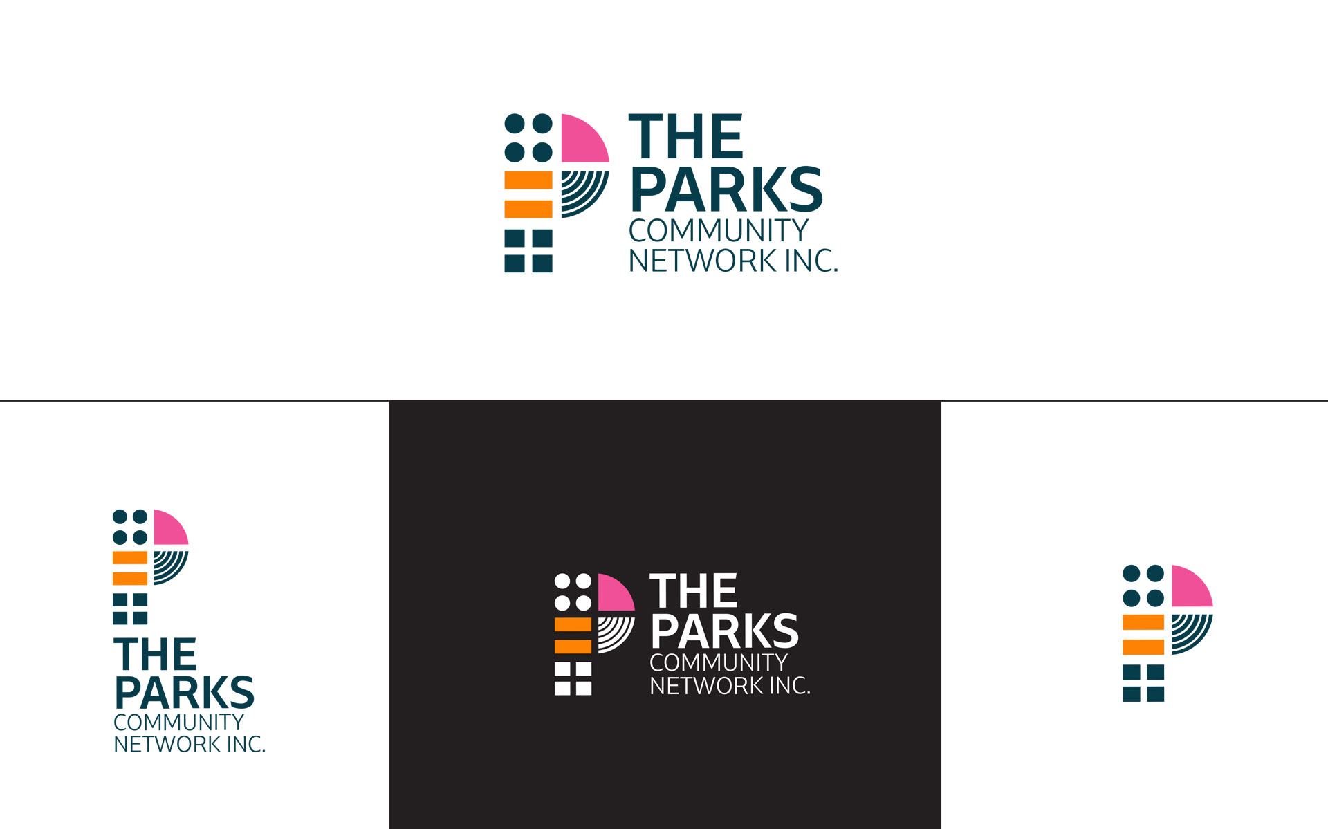
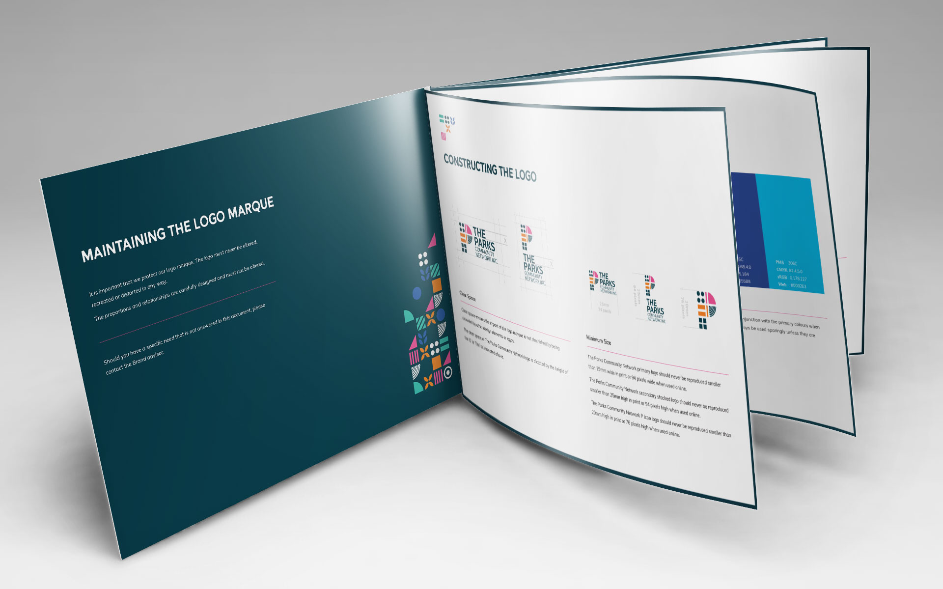
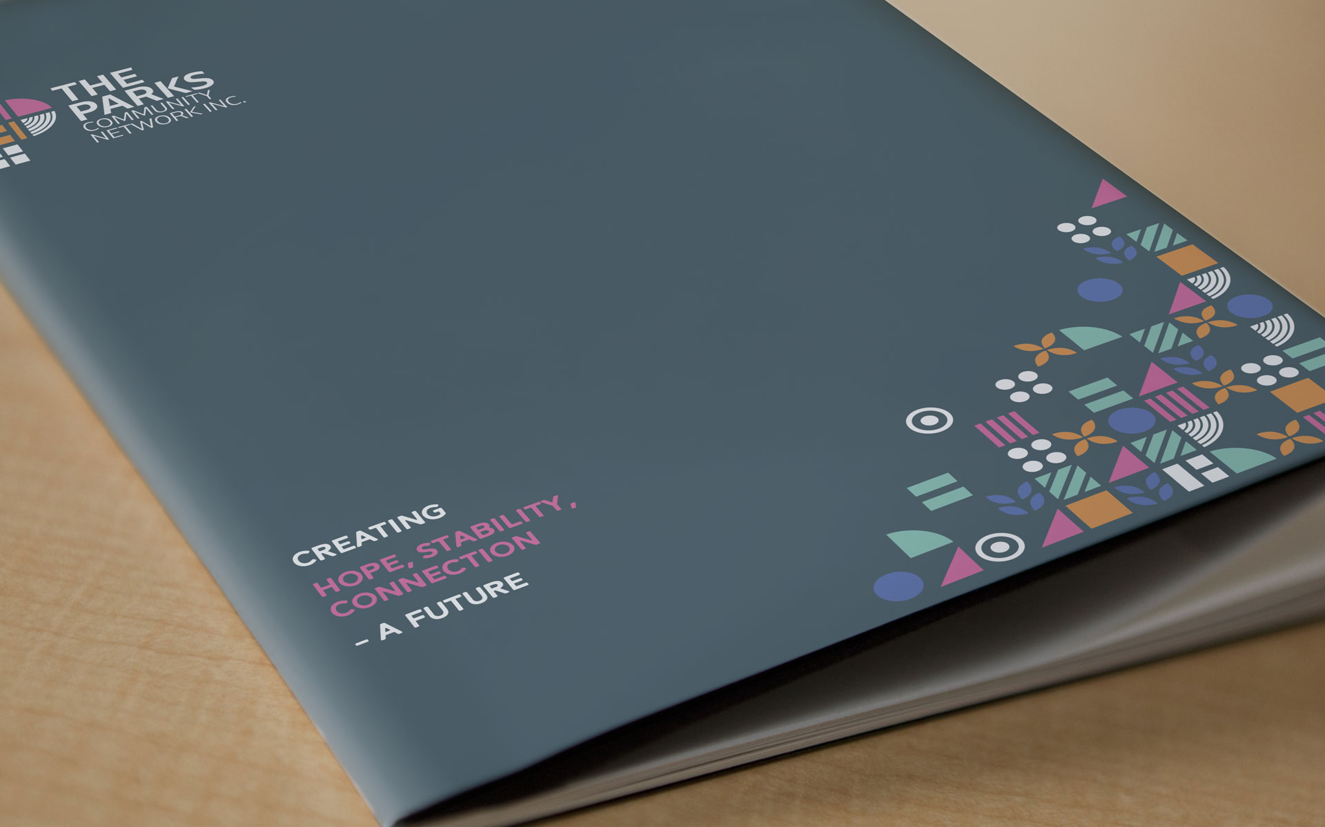
Working with Zadro Agency, I was asked to assist with a new logo & brand for The Parks Community Network.
The Parks Community Network are a community focused group helping people for an array of different backgrounds settle into the community in the Western Suburbs of Sydney.
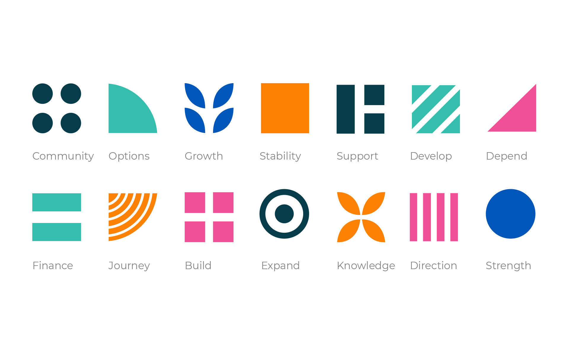
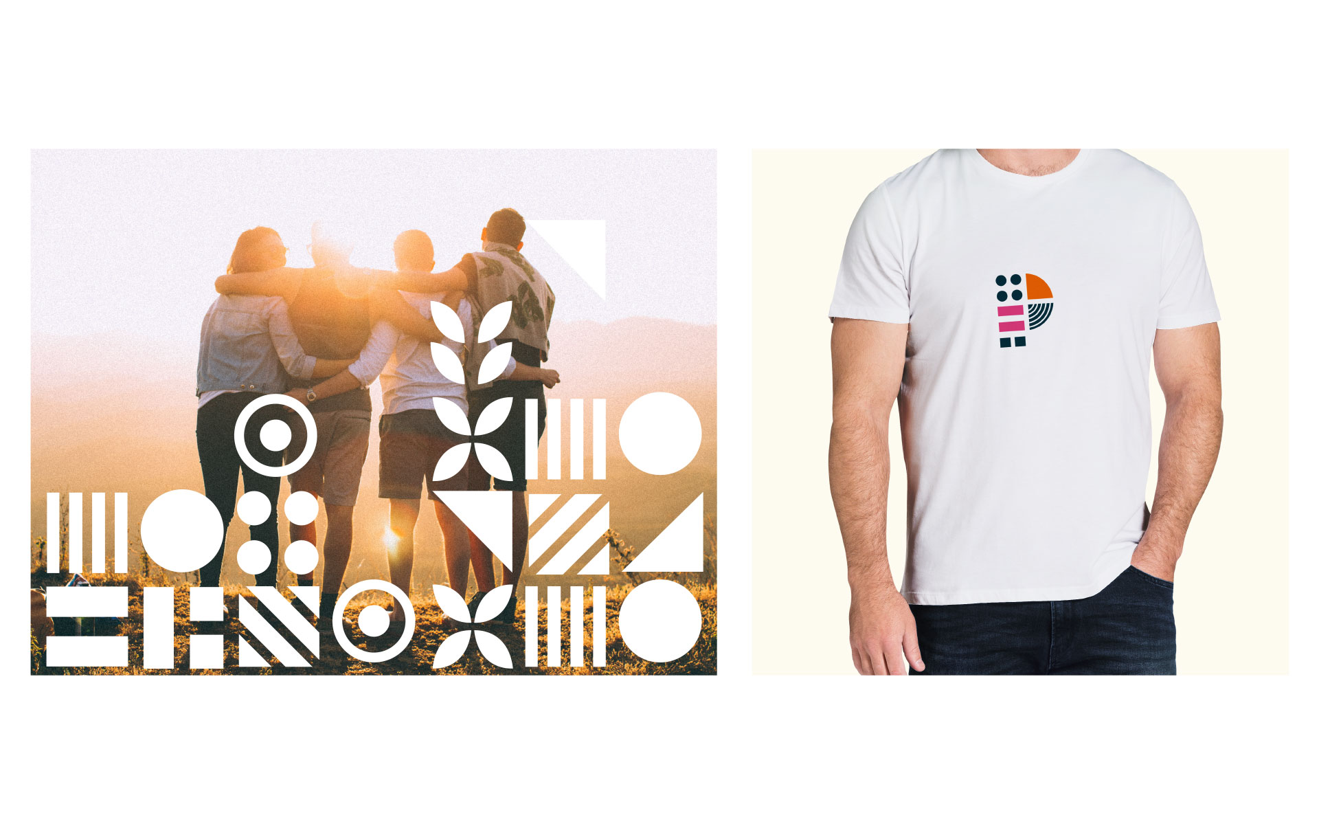
With the logo and branding needing to communicate both the areas of support along with the sub branches of the network, I created brand elements which represented the various offerings which when bought together also represent the company as a whole.
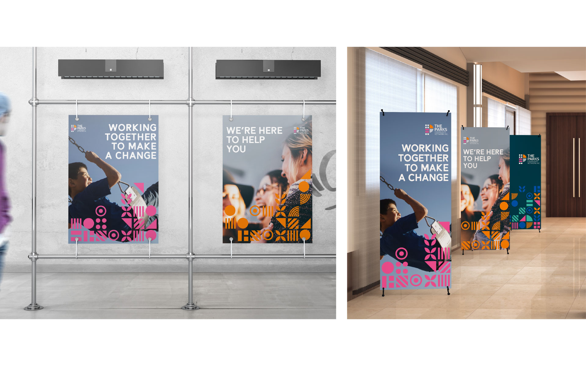
The brand elements and bright colour palette are used strongly throughout the stationery and associated marketing pieces highlighting the importance of the network coming to work together as a whole.
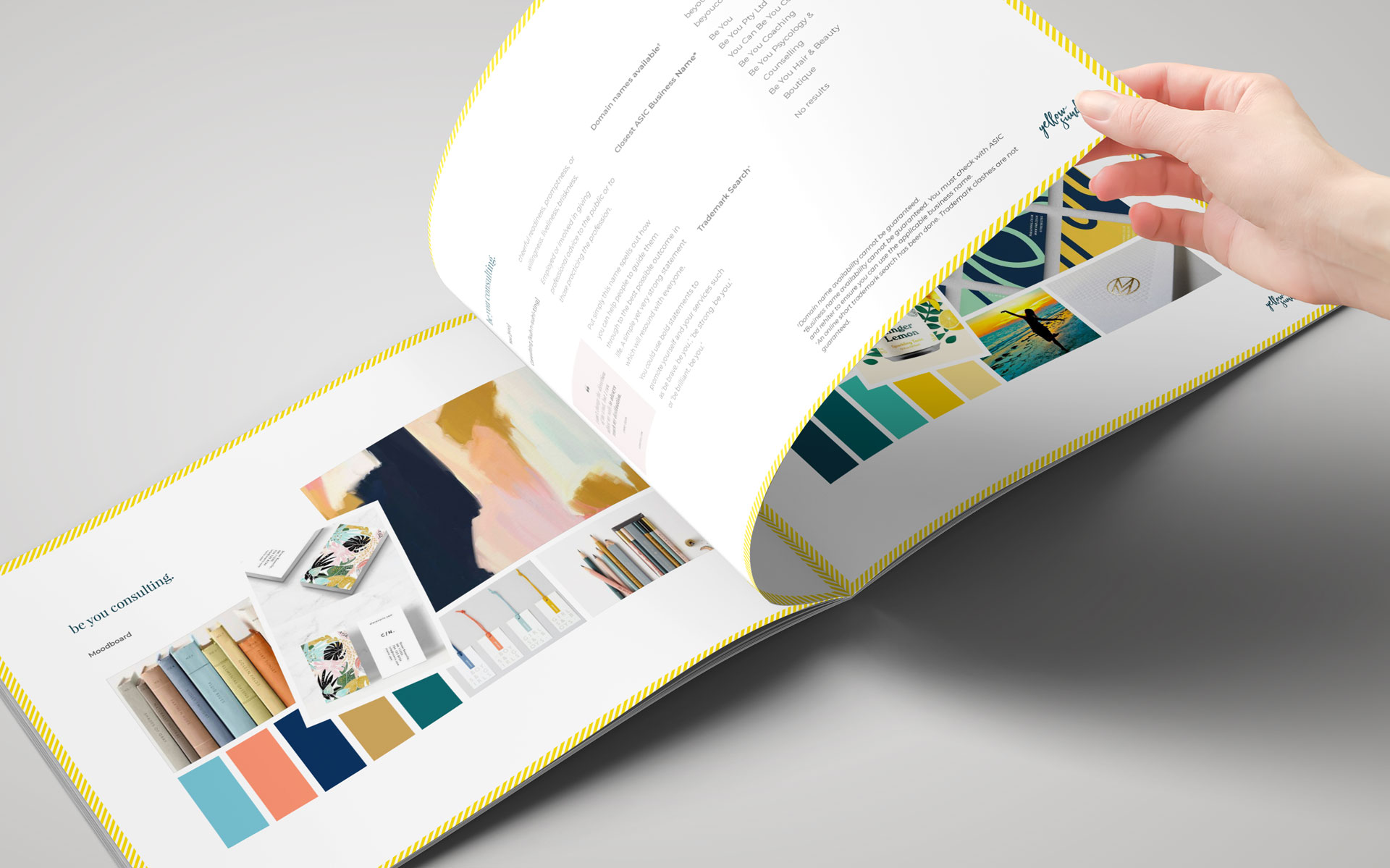
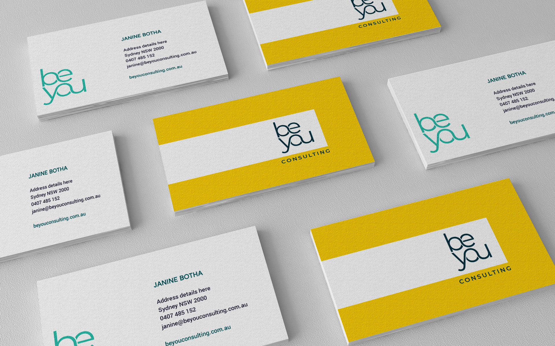
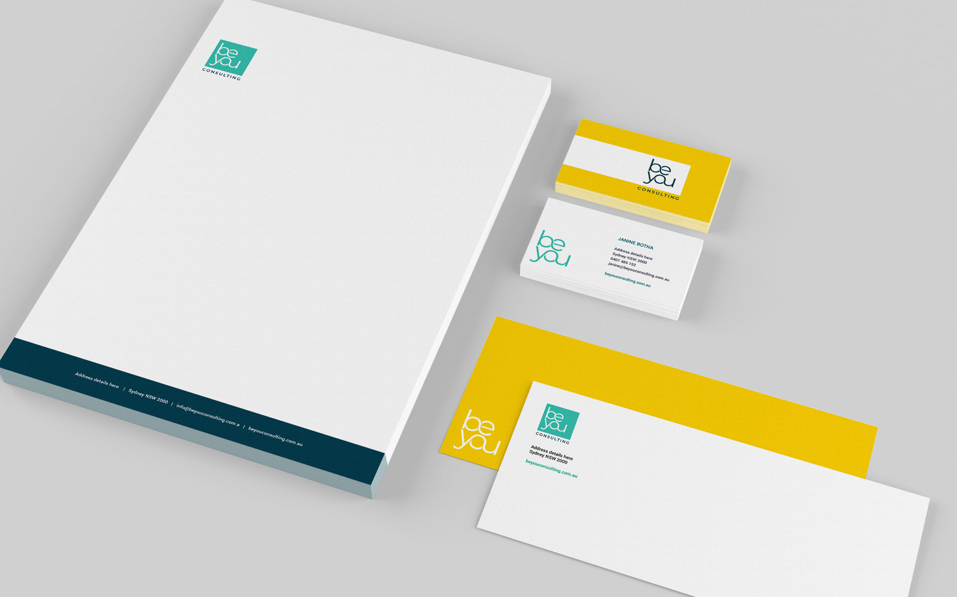
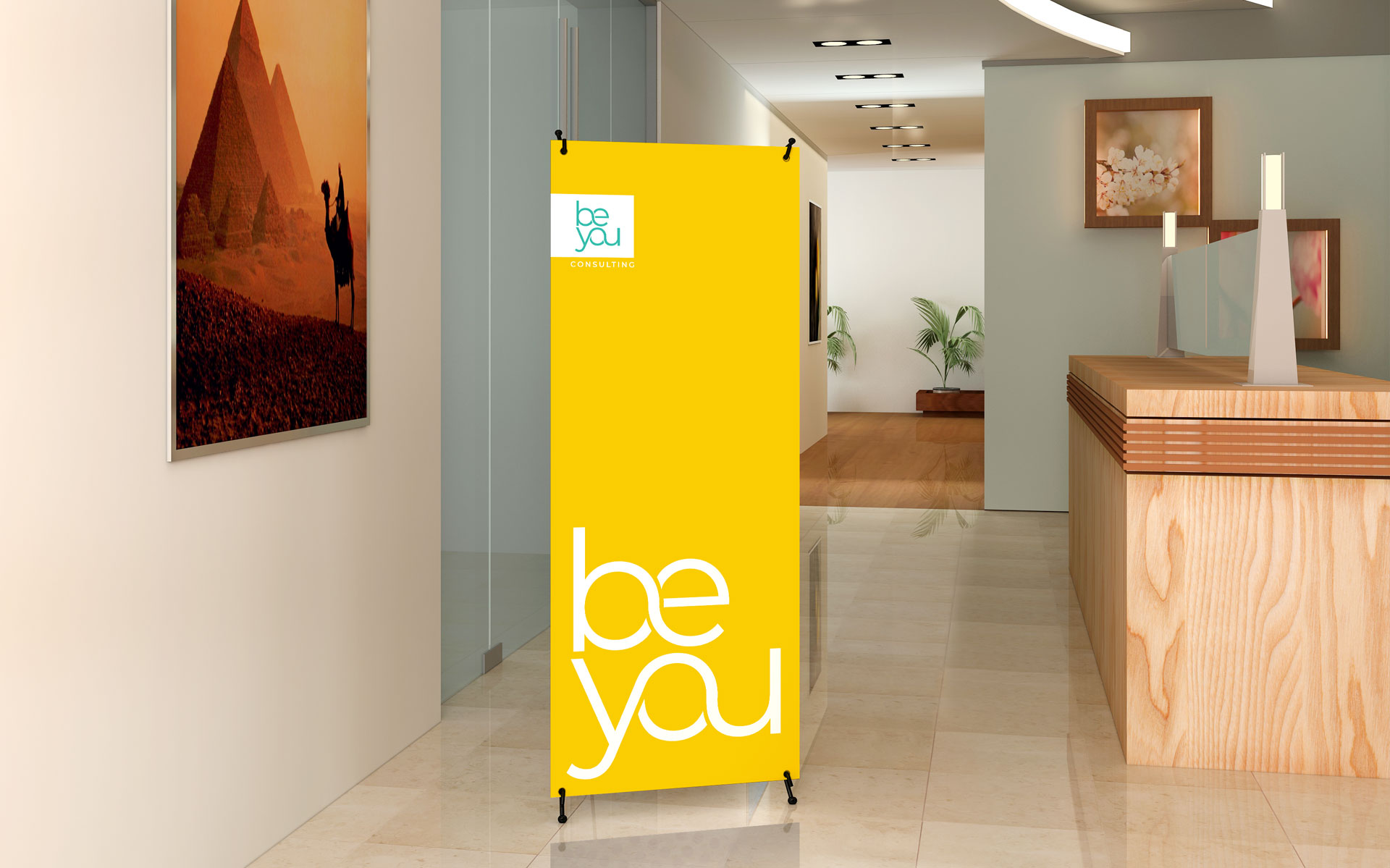
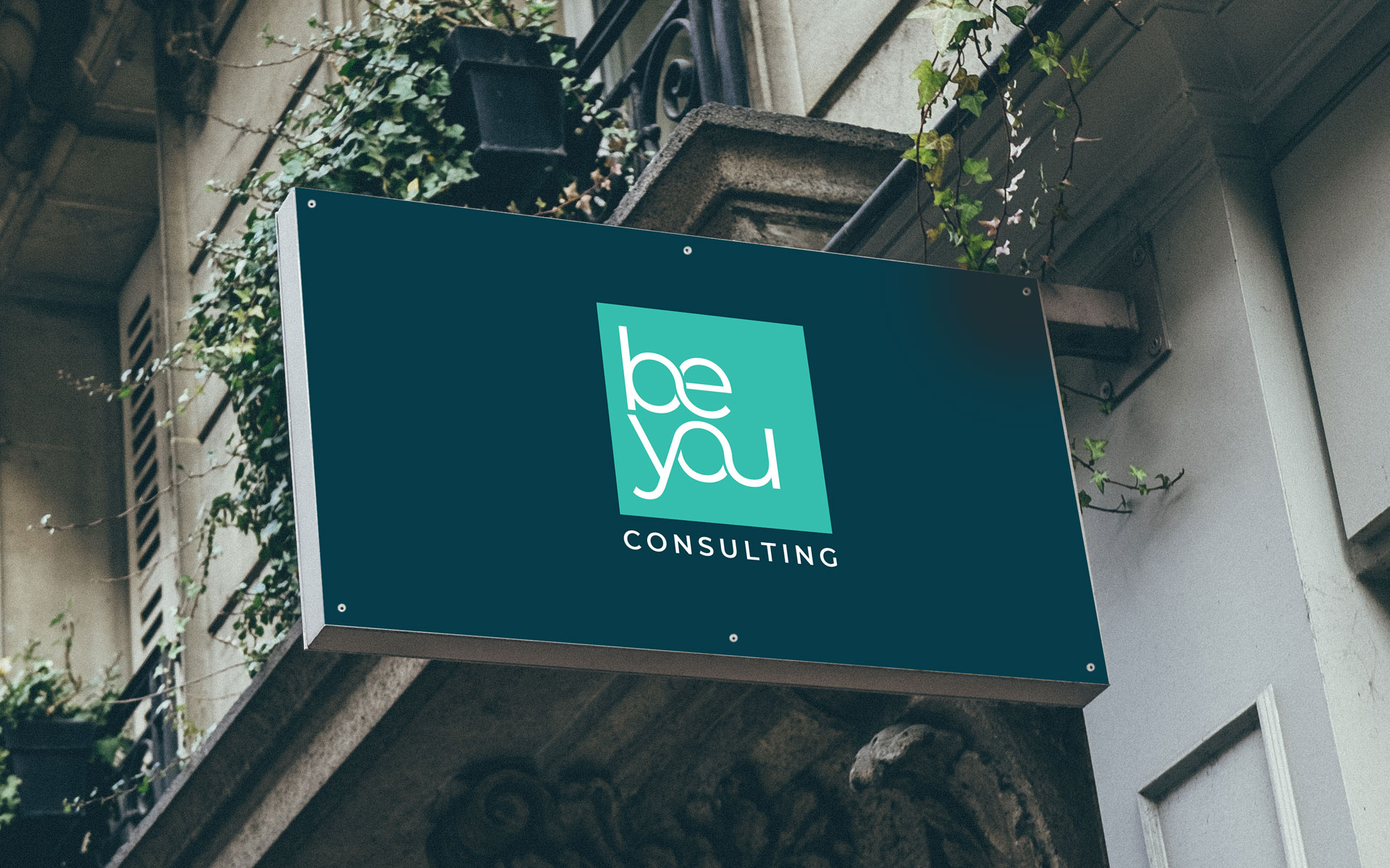
Be You Consulting is a transformational coaching consultancy. Originally BUtoFly, I worked to develop a new name and tagline. From here I created a new logo and surrounding brand which flowed onto various marketing materials.
The company delivers change based on the individuals core strenghs. This is represented by the logo block and the interchanging letters represent the differing paths individuals can achieve with the help of Be You Consulting.
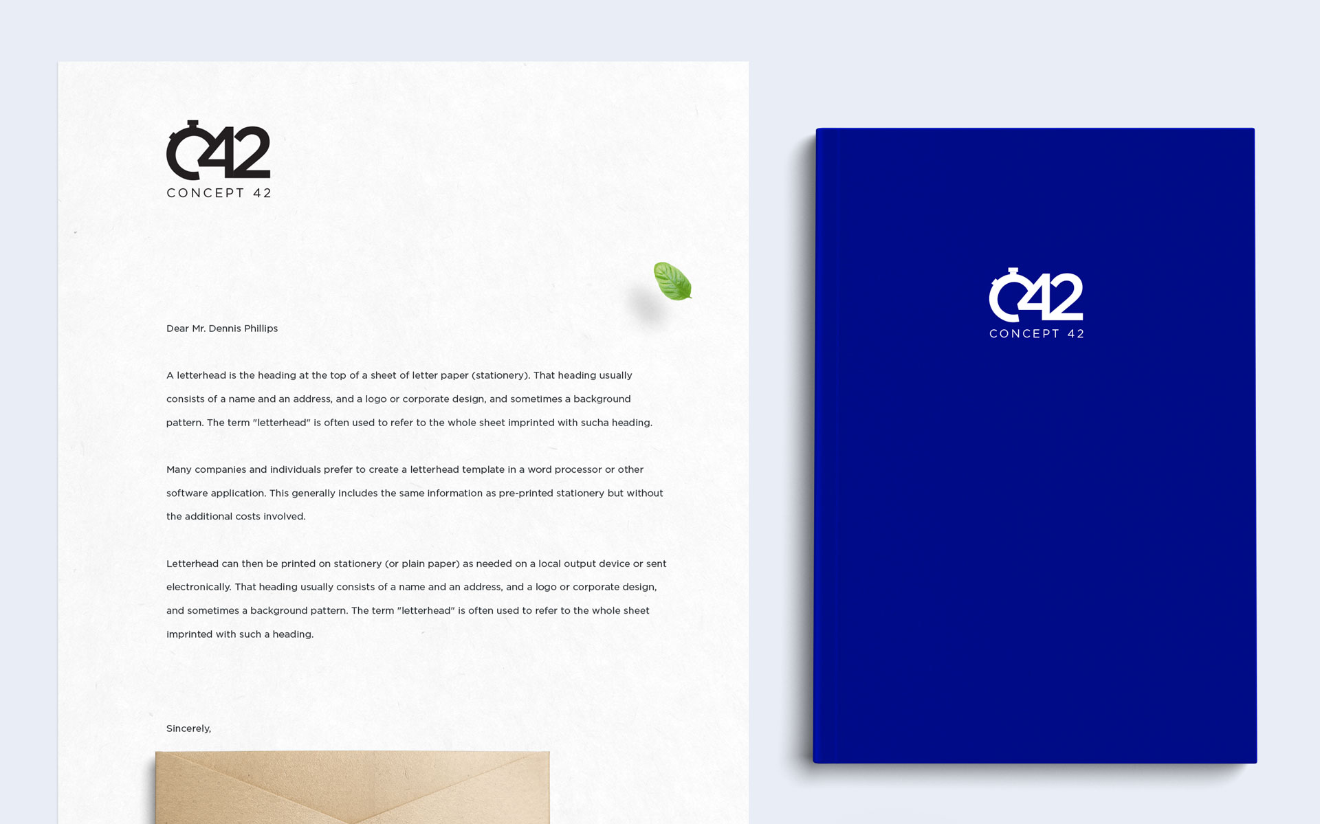
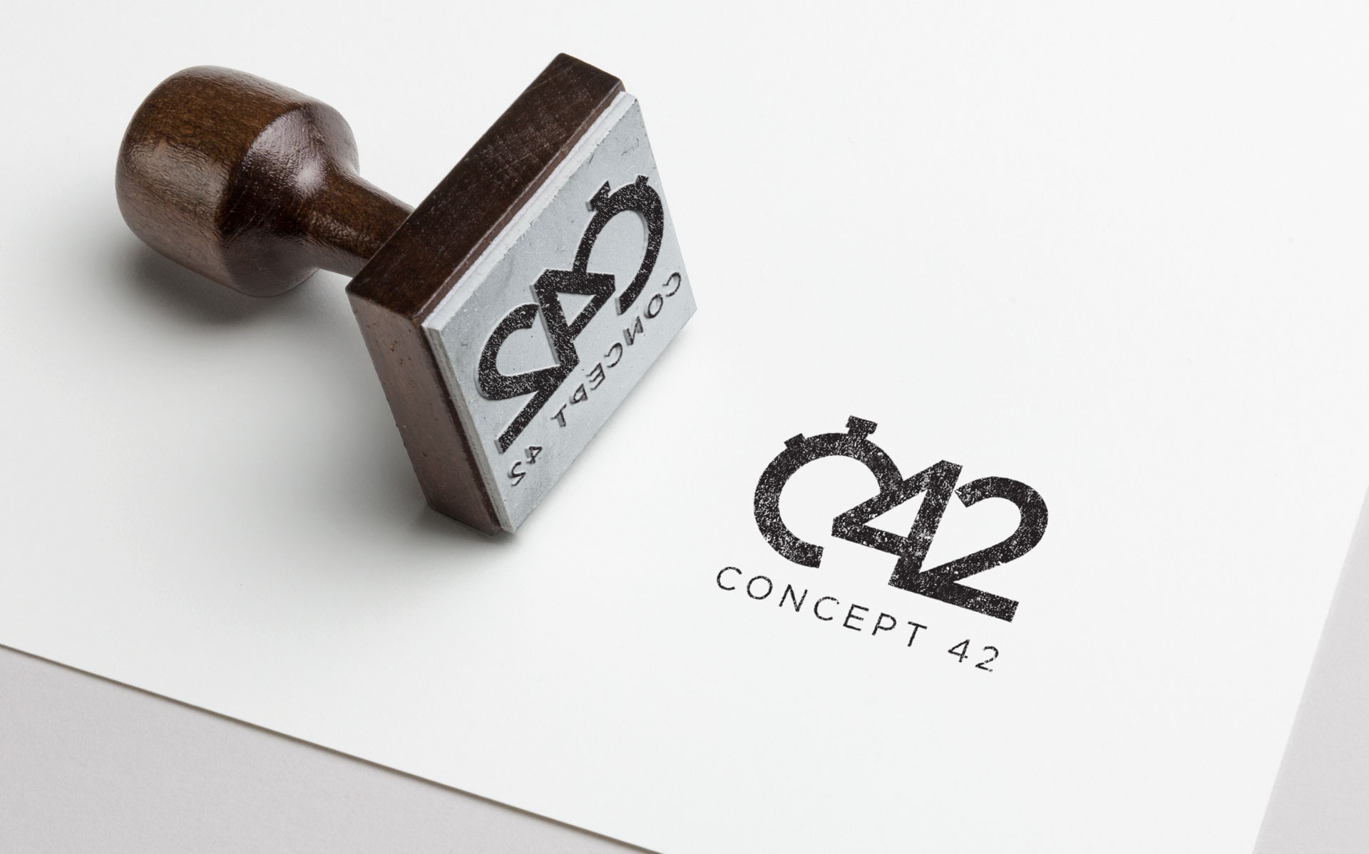
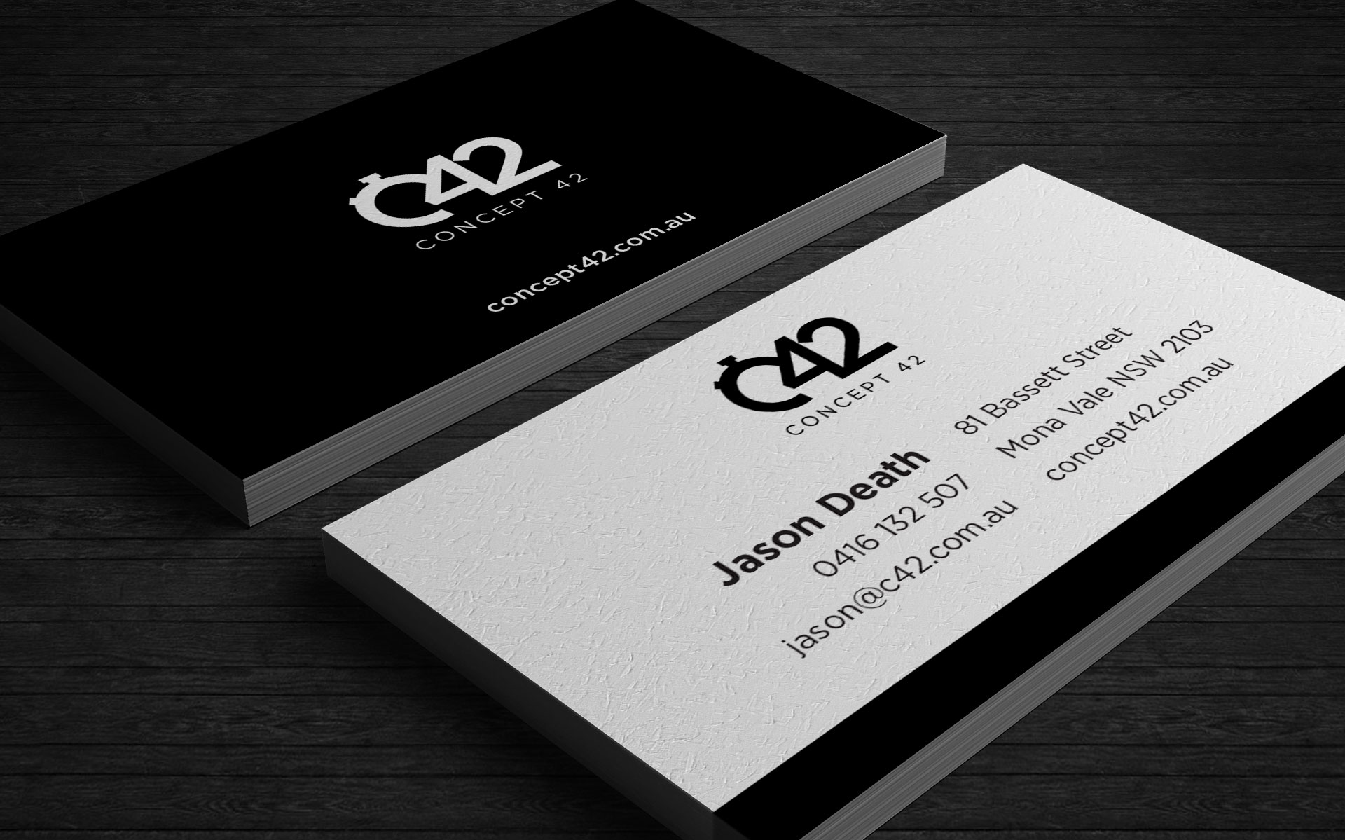
Concept 42 is a new gym offering training sessions based on 42 minute intervals. They needed to upgrade their logo & branding to sit in line with their offering.
Focusing on the time concept, I created an iconic logo stamp which can be used in line with the company title or stand alone.
A clean palette of black and white with hints of blue and orange set the perfect tone.
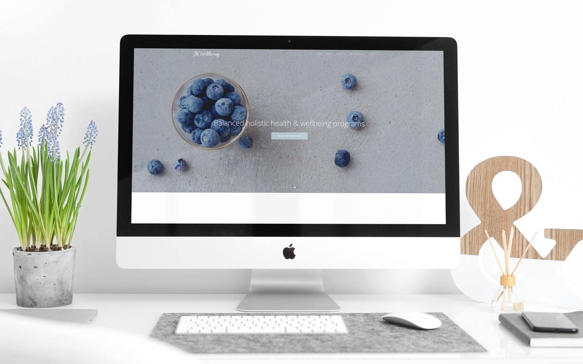
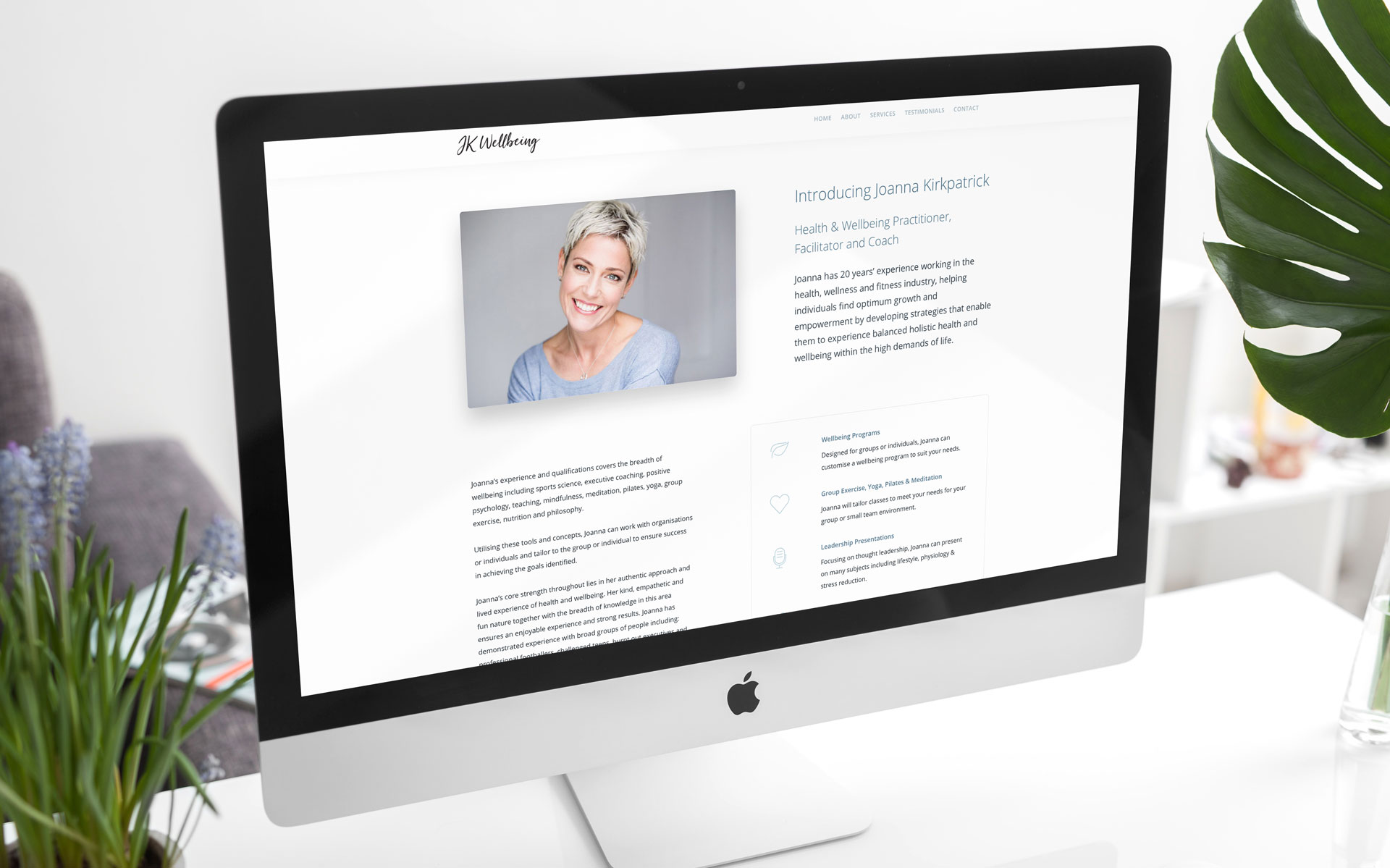
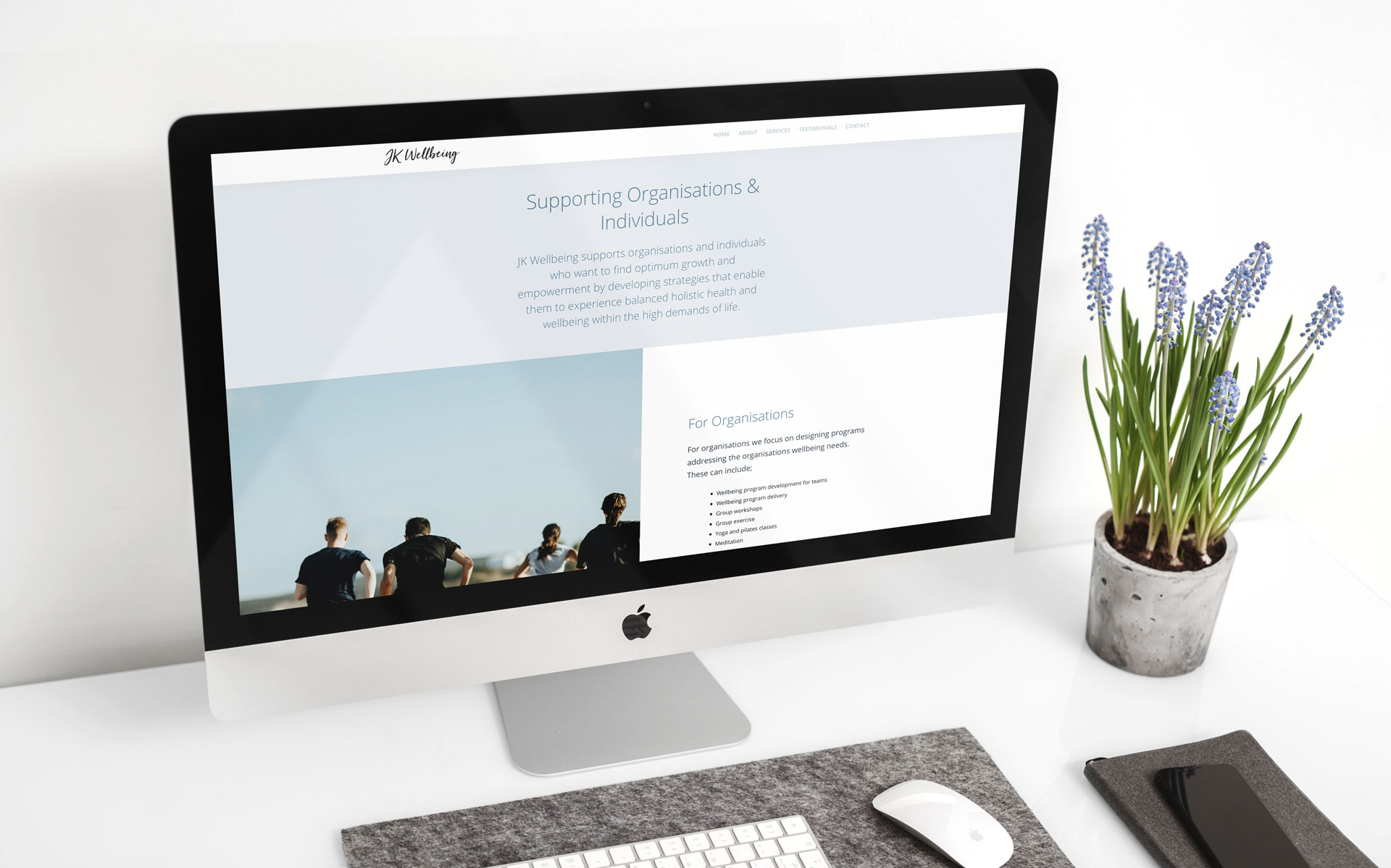
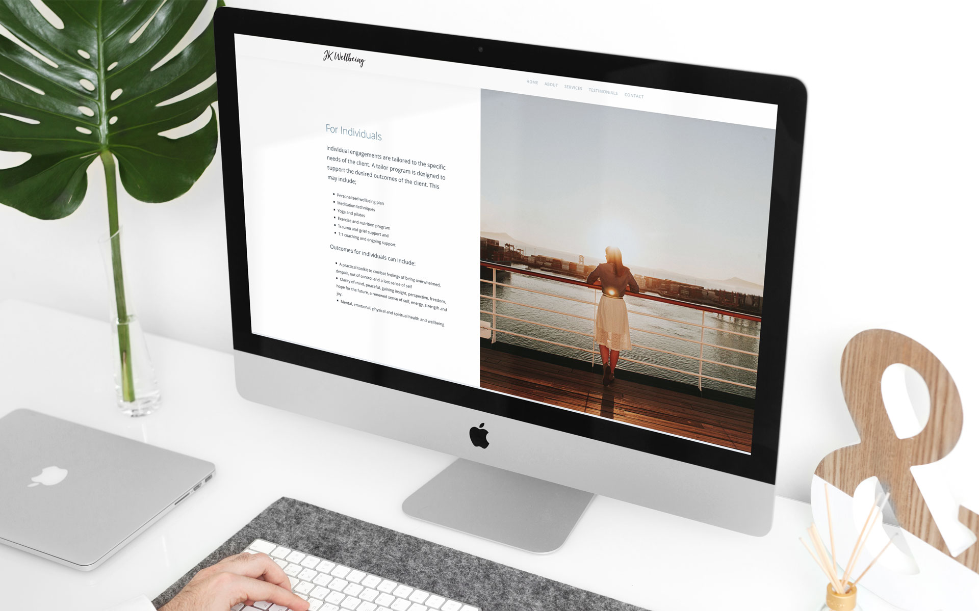
Joanna Kirkpatrick needed an online presence to promote her health & wellbeing practice.
Keeping the nature of the site simple and clean – in line with her business objectives – was the key to designing and building a minimal yet impactful website.