Kite Centre

Kite Centre Branding & Marketing designed by Amy at Yellow Sunday

Kite Centre

Home  /  Work  /  Kite Centre

work completed

Logo & Branding
Marketing

challenge

KITE Centre is a new kids health care centre on the Northern Beaches. The new centre will be located a hop, skip & a jump away from the new hospital and will cater for those with special needs.

Aiming to keep the logo simple & playful, I focused on the acronym KITE within the centre’s name. The green hues used within the new branding help to support wellness, life, renewal, nature and energy – all of which are a focus for the business.

The ‘K’ with the negative child and kite can be used as a stand alone icon which sums up the business name and its meaning in one.

The Yin Space

The Yin Space designed by Amy at Yellow Sunday

The Yin Space

Home  /  Work  /  The Yin Space

work completed

Logo & Branding

challenge

The Yin Space needed a new logo & brand to launch the next level of their Yoga class & retreat offering.

With a calm, relaxed atmosphere and the link to the earth, we created a suite of patterns to compliment the elements of the earth. These are used throughout all collateral from their website to their business cards tying the brand back to nature.

The meaning behind The Yin Space is to create a continuous calm mind and body which is reflected in the infinity symbol worked into their logotype.

Activenture

Activenture logo & branding designed by Amy at Yellow Sunday

Activenture

Home  /  Work  /  Activenture

work completed

Logo & Branding
Stationery
Tshirt Graphics

challenge

Activenture is a multi-faceted sporting festival organisation based on the Northern beaches of Sydney. They wanted a new corporate brand which pushed the active, energy of their offering whilst still remaining balanced.

Using a bright green & blue gradient teamed with the movement in the connection between the A & V, a subtle reminder of the dynamic nature of the business is left in a highly visual, corporate style.

Adflow

Adflow marketing materials designed by Amy at Yellow Sunday

Adflow

Home  /  Work  /  Adflow

work completed

Marketing Materials
Powerpoint Presentations

challenge

Adflow is a leading DOOH company specialising in taxi top & wrap offerings. They needed to up their appeal with their internal and external marketing communications. We helped to create a new bright & impactful suite of materials to help get their name out there.

City of Canterbury Bankstown

City of Canterbury Bankstown Vehicle Ideas designed by Amy at Yellow Sunday

City of Canterbury Bankstown

Home  /  Work  /  City of Canterbury Bankstown

work completed

Vehicle Mockups

challenge

Working with Zadro Agency, I was asked to help them create vehicle wrap ideas for a potential recycling campaign they were going to roll out.

I had to find a suitable style of vehicle that could travel easily with branding on the exterior with the ability to open up to reveal an information booth style area for the city to showcase their recycling campaign.

I designed several possible vehicles even throwing in an eco friendly small option too!

Seed People Consulting

Seed People Consulting rebrand designed by Amy at Yellow Sunday

Seed People Consulting

Home  /  Work  /  Seed People Consulting

work completed

Logo & Branding
Company Strategy Documents
Powerpoint Template

challenge

Seed People Consulting is a boutique HR & people consulting company based in Newcastle. They wanted to update their logo and create a fresh new brand to see in the new year.

Adding to the original colour palette of orange and teal, the blue-grey hues work well to balance out the bright tones and create a sense of grounding. The leaf element centres through the logo to represent growth – growth of the business’ they help and growth of the individuals they develop.

Plumbfection

Plumbfection

Home  /  Work  /  Plumbfection

work completed

Logo & Branding

challenge

Jaimie Keys of Plumbfection asked me to develop a new logo & branding for his plumbing business. It needed to be simple, clean & modern.

Using the water as a guide & the nature of the plumbing business, the new Plumbfection logo was born complete with a drip emerging from the ‘M’. This logo is simple yet effective. It’s eye catching & spells out exactly what services the business provides without the customer having to look twice. Clean, strong & bold.

*This work was undertaken during my time owning & running Vanilla Spin, a boutique design studio based in North Sydney.

Women in Business Network

Women in Business Network

Home  /  Work  /  Women in Business Network

work completed

Logo & Branding
Comprehensive Style Guide
Marketing Materials

challenge

MFAA, the Mortgage & Finance Association of Australia, were after a logo & brand styling for their newly developed network group Women in Mortgage Business Network or WIMBN. WIMBN was aimed primarily at women with the idea of getting those that are like-minded within the industry together to chat all things finance.

A simple, strong logo & brand was created which sums up everything this group is about. The bright pink colouring reflects the female nature of the group, whilst the speech bubble represents the networking side. This element has been taken right through the associated marketing materials & style guide to tie everything together.

*This work was undertaken during my time owning & running Vanilla Spin, a boutique design studio based in North Sydney.

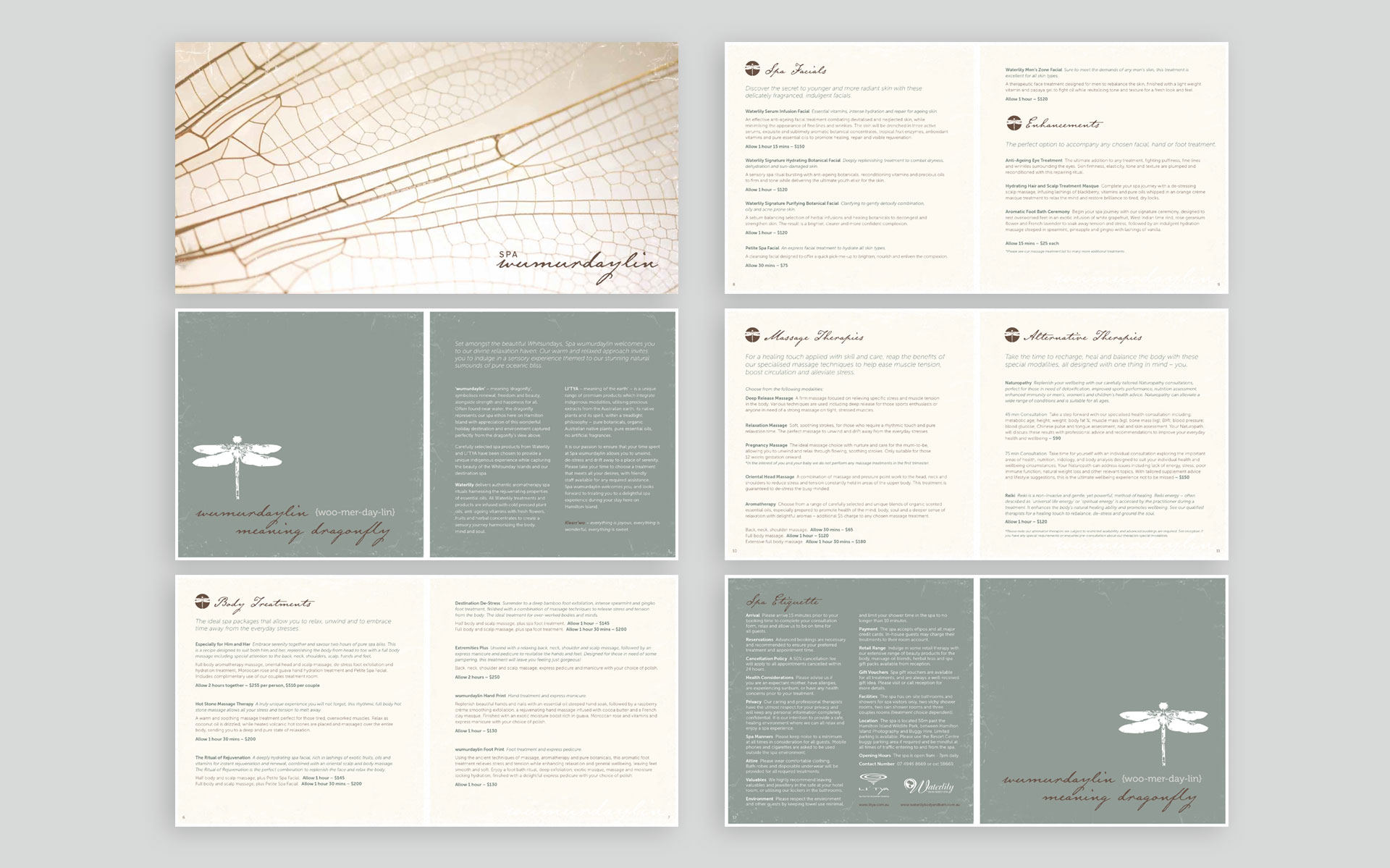
Spa Wumurdaylin

Spa Wumurdaylin

Home  /  Work  /  Spa Wurmurdaylin

work completed

Marketing Materials

challenge

Spa Wumurdaylin is located on Hamilton Island and provides relaxation and beauty services for residents and visitors. Wumurdaylin means dragonfly symbolising renewal, freedom and beauty.

I was asked to create a spa treatment menu that upheld the company style whilst relating back to the nature of the services. The muted colour tones and dragonfly imagery help to align the printed materials to the ideals of the company and their nature-related service offerings.

*This work was undertaken during my time owning & running Vanilla Spin, a boutique design studio based in North Sydney.

Zip Up Your Purse

Zip Up Your Purse website designed by Yellow Sunday

Zip Up Your Purse

Home  /  Work  /  Zip Up Your Purse

work completed

Website Design & Build

challenge

Zip Up Your Purse is a fitness company owned by an energetic Kiwi named Tess. It specialises in helping women to correctly strengthen their pelvic floor.

Tess needed a website to build an online presence & create an opportunity for her company to build its client base & market itself both locally and nationally. With the idea to merge a modern feel with a retro style, we were able to create a merge between the two so the site looks fresh & appealing whilst remaining current.